Pages

WELCOME

This blog was created to act as a record of the cards and other projects that I have made. It is for both my own reference and to help inspire anyone who wants to take a look.

I'd love it if you'd leave me a comment so that I know what you think of my projects and that you've been to visit!

Anyone can comment, even those who don't have a blog. (Just look for the word 'Comments' under the three little pictures at the end of each post). Readers without a blog can add an anonymous comment, but please leave your name (and docrafts username if applicable) so I know who you are!

Slideshows of all the cards I've uploaded to my blog can be found at the bottom of the page.


PEOPLE WHO FOLLOW MY BLOG

Showing posts with label X-Cut. Show all posts

Sunday, 5 March 2017

30-Day Colouring Challenge Day #4 - Rusty Katzelkraft German Shepherd

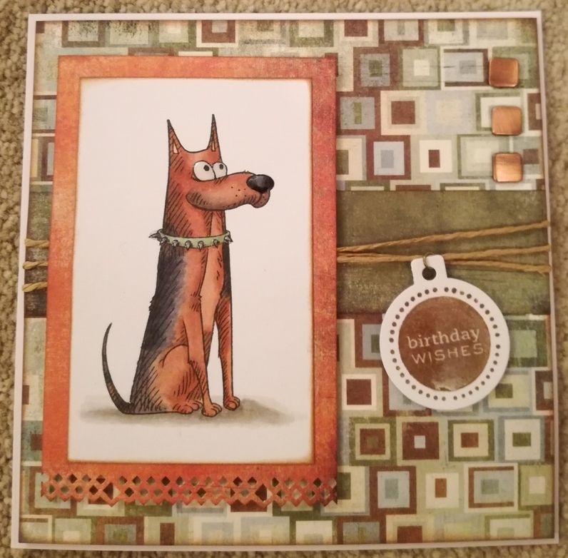
This is my entry for day 4 of the 30-day colouring challenge of March 2017, as organized by the fabulous Kathy Racoosin.


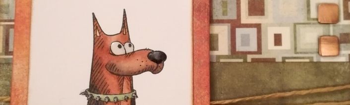
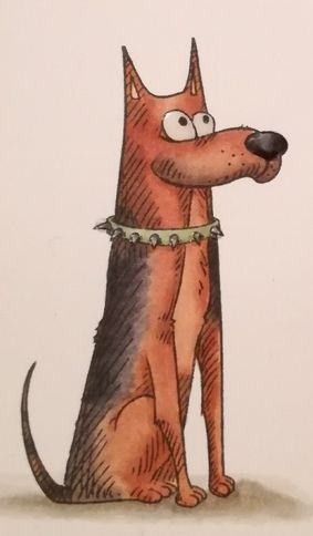
I needed to make a birthday card for my dad, and so, having discovered where I had hidden the Katzelkraft dog images I stamped before Christmas thanks to my friend Kelly, I chose the one I thought resembled a German Shepherd dog the closest.

The image was coloured using Memento Tuxedo Black dye ink and coloured with Copic markers:

Dog: E13, E15, E39, C3, C5, C7, C9, R02
Eyes: C0, C1
Collar: G21, C3, C7
Shadow: W1, W3, W5

I coloured the image so that it looked just like the dog that we had when I was growing up. Rusty, aptly named because of her colouring, was the softest dog you'd ever know and was often a pillow to my little cousins. I thought my dad would appreciate a card like this.


Having coloured the image, the panel was distressed on the edges with Tim Holtz Vintage Photo distress ink, as were the panels of patterned paper from the Basic Grey Archaic paper pad (Relic, Timeworn and Rusty).

The strip of Timeworn paper was added across the Relic paper and wrapped with lengths of natural twine.

Using the round Cuttlebug tag die, a tag was die cut from white card and stamped with the solid 'Birthday Wishes' stamp from the Personal Impressions Paula Pascual Mixed Sentiments stamp set with Versafine Vintage Sepia archival pigment ink. A jump ring was added to the tag and threaded onto one of the lengths of twine.


The image panel was matted onto the panel of Rusty paper, the bottom edge having been punched with the Diamond XCut border punch first. This was mounted over the twine with 3d foam tape, as was the sentiment tag.

Three WRMK square copper studs were added to the top right corner and then the panel was mounted to the 5'75" square cardbase.

To finish off the card, Ranger Glossy Accents was added to the dog's eyes and nose, the collar studs and the sentiment.

Monday, 30 November 2015

Blue and Yellow Aeroplane in Clouds

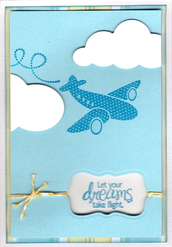
This is the card that I made for my 'little' brother this year. He's actually 31 but being 10 years younger than me he'll always be my 'little' brother.
 
I really liked this aeroplane stamp from the Kaisercraft Little Man stamp set, so decided to make a nice simple card with it.
 
 
I started by creating the front panel of the card. I stamped both the aeroplane and trail from the Little Man stamp set using Versafine Deep Lagoon archival pigment ink. I then die cut an aperture from the panel using a label die from the XCut Tags and Bookplates set of dies.
 
A couple of clouds were die cut from white card using the Memory Box Puffy Clouds dies and adhered to the card front using 3D foam to create dimension.
 
Lengths of yellow Baker's twine from the Dovecraft Riverbank Rivals twine pack was tied around the card front threaded through the aperture.
 
The sentiment, from the Amy R Be Happy set of stamps was then stamped onto a scrap of white card using the Deep Lagoon ink and matted behind the aperture using 3D foam.
 
The front panel was then matted over a panel of the blue and yellow striped paper from the DCWV Floral Prints paper stack.


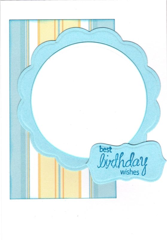
The inside of the card was also decorated using the same patterned paper and cardstock as the front of the card.

A circle and big scalloped circle were die cut using Nestabilities dies and the sentiment, also from the Be Happy stamp set, was stamped onto the label cut out from the front panel using the Deep Lagoon ink.

Friday, 27 November 2015

Cream and Blue Tatty Teddy Panels

Another look back into the past here with a couple of old cards from 2011!!!

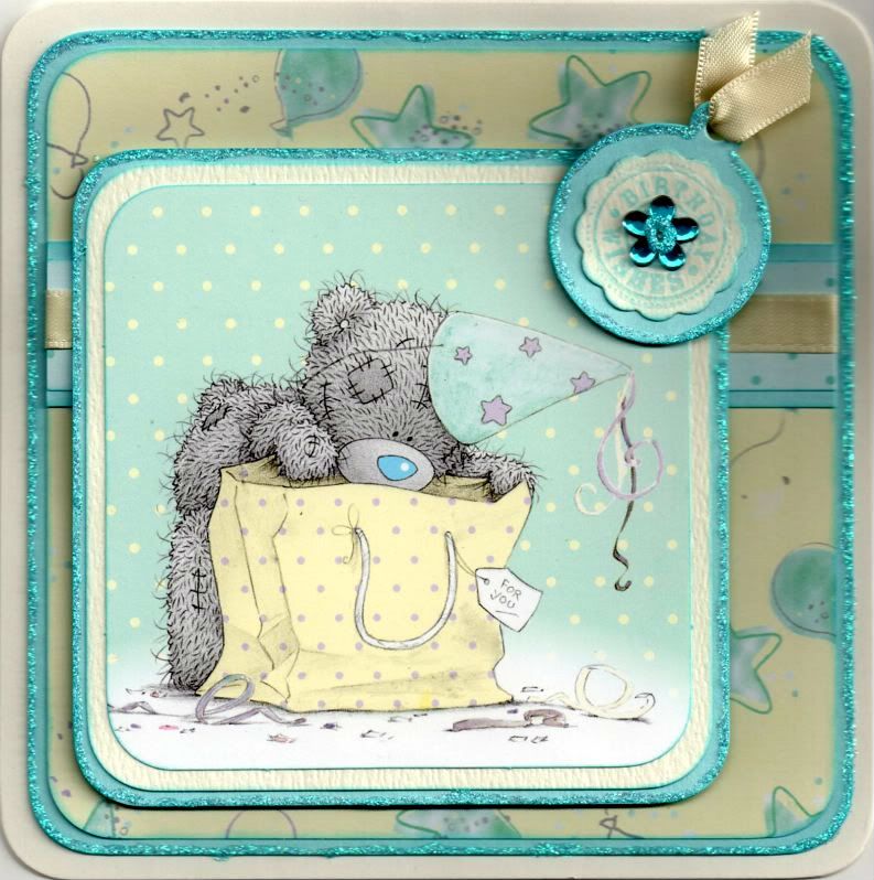
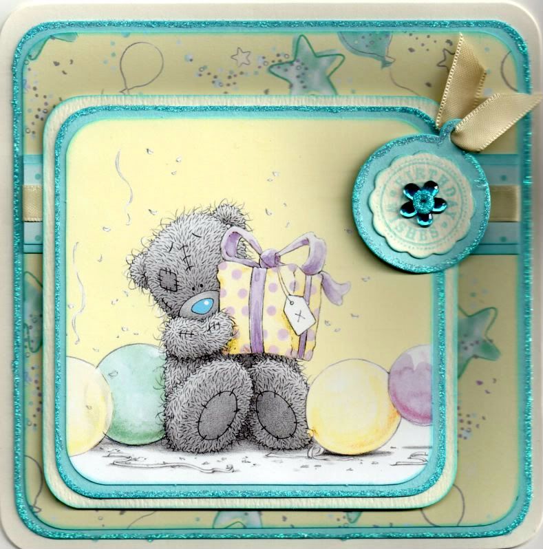
These are a couple of quick cards I made for a couple of 8-year old girls using the printed panels in the Me To You Especially For You paper pack.


The corners of the printed image were rounded using the large XCut corner rounder punch and matted onto light blue and cream card.

A strip of the blue polka dot paper from the same paper pack was matted onto the light blue card and a length of cream satin ribbon was wrapped around and matted onto a panel of the yellow stars and balloons paper. This was then matted onto the light blue card.

A tag was die cut from the light blue card using the Cuttlebug round tag die. A big scalloped circle was die cut from cream card using a Nestabilities die and stamped with the 'Birthday Wishes' circle sentiment from the Hero Arts Birthday Messages stamps set using ColorBox Aqua pigment ink. The scalloped circle was matted onto the tag and a blue Papermania flower gem was added in the centre. A short length of the cream satin ribbon was threaded through the tag and added in the top right corner of the image panel.

All the edges of the blue layers and the centre of the flower gem were highlighted with Craft Planet Ice Blue glitter glue.

A similar card was made with a different image panel from the same paper pack.

Monday, 16 November 2015

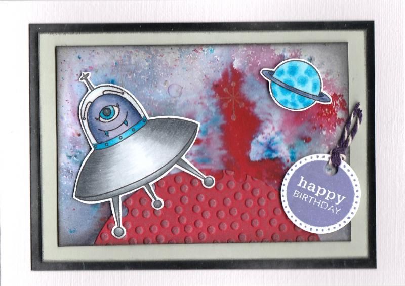
Red Grey and Purple Brusho Aliens

OK - I'll admit it. I had a go with some Brushos. These are definitely not my type of crafting. Far too messy and uncontrollable!!
 
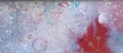
But, I made a background using my friend's set and I decided to make it into a card. When looking at the background, I decided it looked a bit space-like, so I thought I'd make a kids' card and use my alien stamp set.
 
So, to create the background, I used quite a few different Brusho colours onto a sheet of white card, namely black, grey, crimson, scarlet, cobalt blue and then these were spritzed with some water. Once the colour was almost dry, some white Brusho was sprinkled over the top and no water added to create some contrast.
 
The background was then over-stamped with a dotty star stamp from the Kirsty Wiseman Terrestrial Friends stamp set using the Heat It Up! Metallic Silver pigment ink.

 
The next stage was to select the best area of the background for the card. This piece had a flare of red which I thought fitted well with my idea of the card. The edge of the panel was then distressed using Tim Holtz Black Soot distress ink.
 
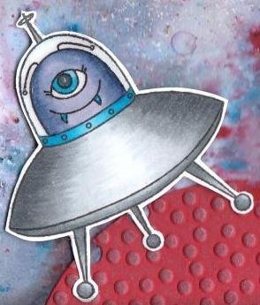
The alien and spacecraft stamp and the planet stamp, also from the Terrestrial Friends stamp set, were stamped using Memento Tuxedo Black dye ink and coloured with Copics:
 
Copics

 
Monster/Planet: B01, B02, B05, B06, BV00, BV04, BV08
Spaceship: C1, C3, C5, C7, B02, B05, B06
 
 
These images were then fussy cut and Ranger's Glossy Accents were added to the glass section of the spacecraft image.
 
To ground the image and create a foreground, a planet was created by cutting a piece of red card into a circle using a Nestabilities die and then embossed using the Crafts-Too Polka Dots embossing folder. Silver-Blue and Golden White metallic wax rub-ons from Craf-T Color Kit #3 were rubbed over the embossed detail to highlight it. The circle was trimmed into a semi-circle and adhered to the Brusho panel, after a few 'craters' were cut from the edge of the circle using a single hole punch.
 
 
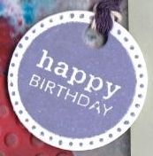
The sentiment, from the Personal Impressions Paula Pascual Mixed Sentiments stamp set, was stamped onto white card using the Versafine Majestic Purple archival pigment ink and die cut using the circle tag die from the XCut Tags and Bookplates set of dies. This was then threaded with purple Baker's twine from Gorjuss.


All the components were then adhered to the card front, matted and layered onto grey and silver mirror card.


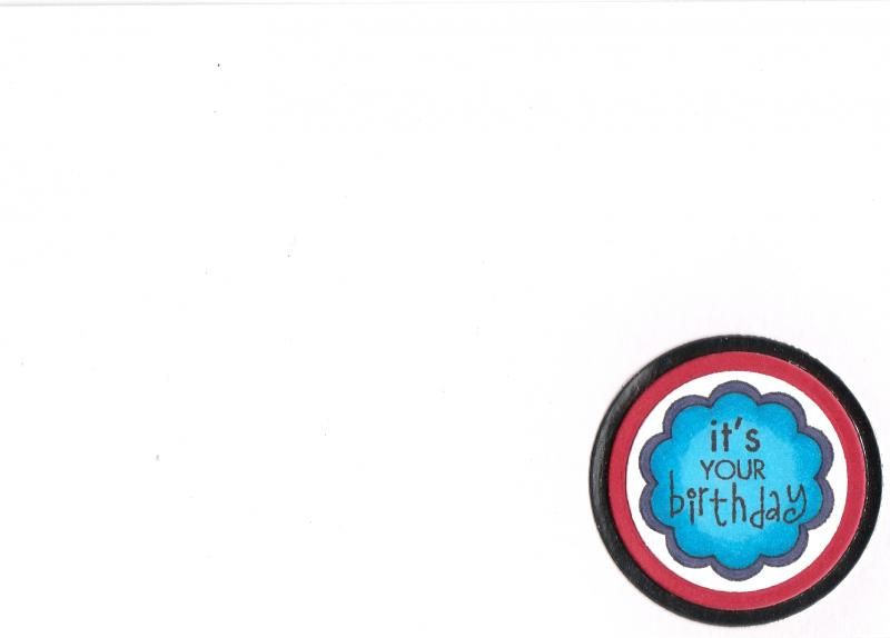
The inside of the card was also decorated, using the It's Your Birthday circle sentiment stamp from the Hero Arts Birthday Messages stamp set. The sentiment was coloured using Copics to match the images on the front of the card, and then diecut using a circle Nestabilities die and matted onto red and silver mirror circles.

Friday, 6 November 2015

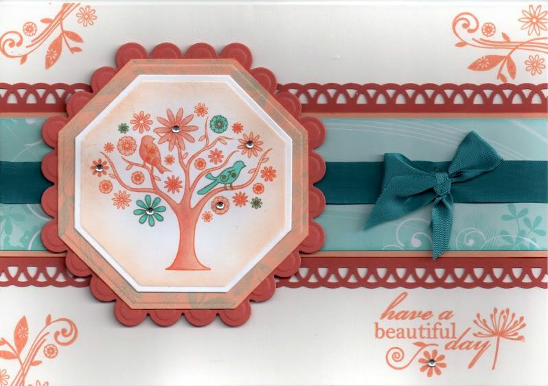
Turquoise and Orange Songbird Tree

So, here we are again with one of my older cards. This one is from 2011.
 
I bought this set of papers and stamps when they first came out, full of great ideas. They are the Papermania Birdsong papers. Of course, as soon as I got them home, all ideas fled from my mind and they've been sat in various boxes every since!!!


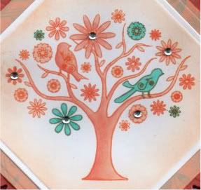
The patterned paper was chosen firstly and the image stamped to match. The Floral Bird Tree stamp, from the Papermania Birdsong Blossom stamp set, was stamped using Memento Tangelo dye ink and coloured using Copic sketch markers:
    Tree/Leaves/Bird 1: YR00, YR02
    Bird 2: BG11, BG45, BG49
    Flowers: YR00, YR02, BG11, BG45, BG49
    The image was then die cut using a Nestabilities Octagon die and the Tangelo ink was lightly applied through the die, leaving the white edge. A larger pale orange octagon was also die cut and the edges stamped using the Floral Flourish stamp from the Papermania Birdsong stamp set with ColorBox Aqua pigment ink. These were then matted onto a dark orange scalloped octagon die cut.


A strip of the dark orange card was punched with the XCut Lace Trim border punch and a strip of turquoise floral swirl paper from the Papermania Songbird paper pad was added across it, as was a length of teal seam binding. A bow was created from the teal seam binding with a bowmaker and attached over the length using a glue dot. This wasn't as successful as I'd hoped though as the knot wouldn't lie flat!!

The paper strip was then attached across the card blank and the image panel added to the left of the card blank.

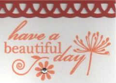
The sentiment, from the Papermania Birdsong Blossom stamp set, was stamped in the bottom right corner using the Tangelo ink, as was the Floral Flourish in the other corners.


Clear faux gems were added to the main image and to the sentiment.

Friday, 30 October 2015

Green and Orange Dressy Miss Anya Pencils On Kraft Card

This is an up-to-date card from me today.

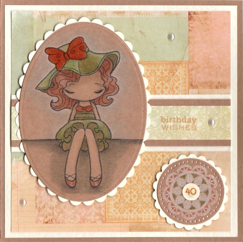
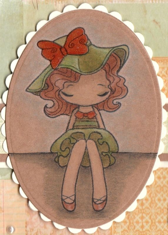
This is the card that I made for my sister for her 40th birthday earlier this month. It's always a worry when your 'little sister' hits 40 - a big reminder that you are the 'big sister'!!!
 
Anyway, back to the card!
 
This card uses a technique I've never used before - colouring with pencils onto kraft card. Unfortunately I can't afford the lovely Prismacolor pencils, so I have used the WHSmiths set of 36 colouring pencils here. The results probably aren't as striking as they might have been had I used those pencils, but I think it works all the same.
 
 
I started by stamping the Miss Anya Dressy image from The Greetings Farm with Memento Tuxedo Black dye ink onto the kraft card and used a selection of the pencils to colour her in. To blend  the pencils, I used plain old baby oil.
 
Once the colouring was finished, I added some clear Wink Of Stella to the orange sections of the image, so her collar, shoes and bow.
 
The image was then diecut using a Petite Oval Nestabilities die and matted onto a cream scalloped Petite Oval die.
 
 
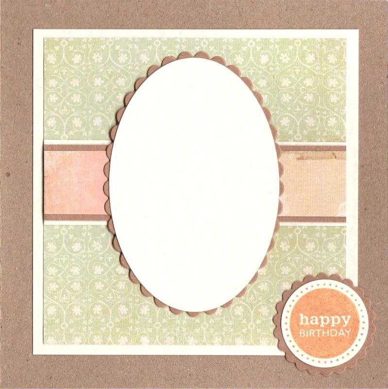
 A piece of collaged patterned paper from the Prima Songbird paper pad was matted onto the front of the card and a strip of blue paper from the same paper pad was matted across it.
 
The sentiment, from the Personal Impressions Paula Pascual Mixed Sentiments stamp set was stamped directly onto the patterned paper using Memento Cantaloupe dye ink.
 
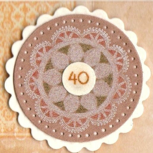
The next step was to remind my sister as subtly as possible that she was hitting a landmark birthday. To do this, I needed some small number stamps, but I don't have any. So I resorted to printing some out from the computer and diecutting them using one of my cog dies from the XCut Chronology Cogs set.
 
 
The die highlighted above has just the right sized circles that I required.
 
Firstly, the doily image from the Martha Stewart Doily stamp set was stamped onto kraft card using Memento Luxe Wedding Dress pigment ink. This was then coloured using a couple of the WHSmiths pencils that were used in the main image.
 
 
The inside of the card was also decorated, using matching papers and an oval diecut panel. The sentiment, also from the Mixed Sentiments stamp set, was stamped using the Cantaloupe ink and die cut using a circle Nestabilities die.

Sunday, 5 April 2015

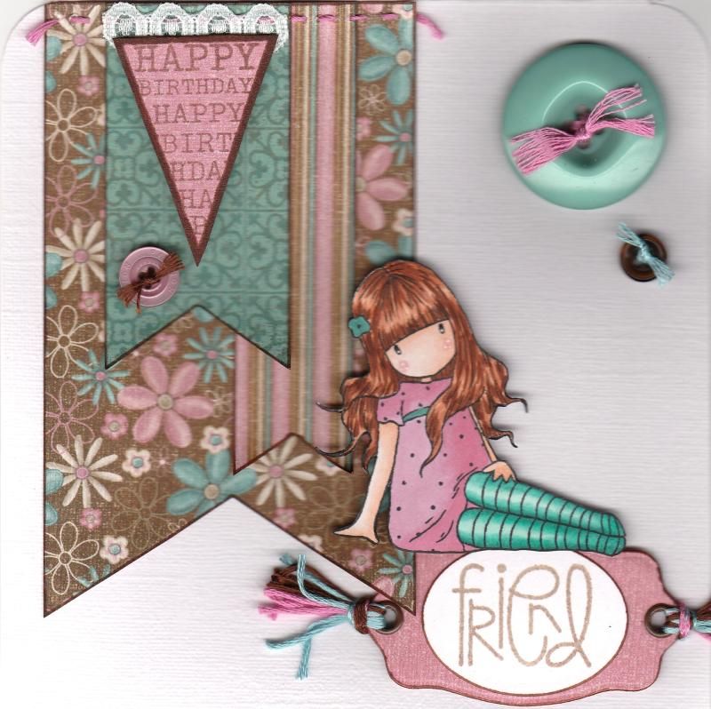
Teal Pink and Brown Sitting Gorjuss Girl with Banners

OK, so I thought I'd have another go at blogging a card as it's been so long since I last did it!
I've decided I'm going to try and blog a current card and then an older card that's still waiting to be blogged after I was offline for so long.

So, it's time to blog a current card. This is one that has been received so I know I can blog it.
 
 
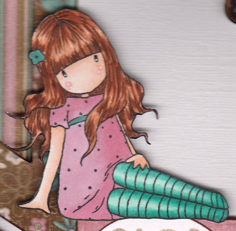
This was a card I was rather pleased with, I have to say. It used one of my older Sugar Nellie Gorjuss Girl stamps, called 'Sitting'.

The papers used on this card are from the Hot Off The Press Floral Ultimate Creative Cardmaker's Pack. There are some lovely colour combo in this paper pad.
 
 The image was stamped using Memento Tuxedo Black dye ink and coloured using Copic markers and then fussy cut.


Copics used:
Hair: E11, E13, E15, E29
Skin: E000, E00, E11, R20
Dress: RV11, RV34
Socks: BG10, BG13, BG15, BG18
Belt/Flower: BG18
 
Fishtail banners were then handcut from a few other patterned papers from the same paper pad and handstitching was added to the top of the largest one. These were then added in the top left corner of the card blank.
 
The Happy Birthday banner from the Hero Arts Friendly Flags stamp set was stamped using Versafine Vintage Sepia archival pigment ink and fussy cut. A small length of white lace was added to the reverse of the image and layered over the handcut banners.
 
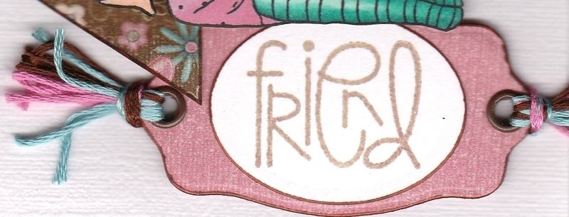
The 'Friend' sentiment from the Paper Smooches Sentiment Sampler stamp set was also stamped with the Vintage Sepia ink and was die cut using a Classic Oval Nestabilities die. This was then matted onto a bookplate diecut from a paper from the same paper pad using a die from the XCut Tags and Bookplates set of dies.
 
Brown eyelets were added through the holes of the diecut and co-ordinating embroidery threads were added.
 
 
The sentiment panel was then added in the bottom right corner of the card blank and the Gorjuss Girl image placed sitting on top of it.
A few co-ordinating buttons were threaded with the embroidery threads and added to the card blank.

Saturday, 23 August 2014

Mixed Media Canvas For My Gran's 90th Birthday

This is a post I've been promising to get finished for an age now.

Way back in May I think it was, I suggested to the members of a cardmaking group that I go to that maybe we would all like to have a go at making a mixed media canvas. I was prompted to do this as I was unable to attend the monthly Bristol Playday and this was their planned project and I had really been looking forward to having a go. Purely selfish reasons!! I was aware that not only was it an ambitious project for us all, but also that it wouldn't get finished in just one evening so we agreed to set aside about 3 weeks to get it done.

Inspiration for my canvas was taken from this Youtube video by Gabrielle Pollacco.

The first week consisted of die cutting a load of shapes from chipboard and mountboard in readiness for the next week when we would begin in earnest.

That was when my project hit a snag. My printer started to play up and I figured it needed a new ink cartridge. So I went to the next group meeting with a very purply tinged photograph of myself and my brother and sister so that I could use it for placement in the hope that I could get another one printed in time for the next week.

The canvas was started and I added a few different pieces of patterned paper from the Basic Grey Sugared paper pad.

Some additional items were then also adhered to the canvas, including skeleton leaves, some crêpe bandage, a heart doily, some crochet lace, some jute and some of the builders' scrim cut into irregular shapes.

The crêpe bandage was adhered down, along with all the other layers, using Mod Podge. I felt like the bandage needed more glue in order for it to stay attached, but it took forever to dry!!!!

Once the Mod Podge had finally dried, I was then able to proceed by applying some homemade texture paste through a Plaid polka dot stencil and a mask diecut using the Sizzix Brick Wall decorative strip die onto the canvas, overlapping some of the elements. I also used a strip of builders' scrim as a stencil with the texture paste.


Whilst waiting for the texture paste to dry on the canvas, I then decided to prepare some silk flowers and some bottle tops ready to be used the following week. These were covered in a layer of gesso.

When the texture paste had dried, I could then add some crochet lace, a Sizzix flourish diecut and a couple of the silk flowers.  The whole thing was then covered in a layer of gesso. In retrospect, I think this should have been watered-down gesso, but you learn from your mistakes, right??


On returning to the project the next week, I was pretty pleased with the way it was looking. However, despite new ink cartridges, I was still unable to print off the photograph so I was having to try and plan it all without the photograph being attached to the canvas.

So, the first thing I did on starting on the canvas was to adhere the flowers and bottle tops to the canvas using silicon glue. I then took a selection of buttons that have been in my stash for a very long time and coated them all in gesso. I then cut small squares of the jute fabric and adhered these inside the bottle tops, mainly because some of the buttons looked a bit lost just sitting in the bottle tops, and this helped to fill them out a little. Once the jute was well stuck into the bottle tops, I could then add the buttons.

I then die cut some circle frames from cardboard using circle and scalloped circle Nestabilities dies and added these around both buttons and flowers on the canvas.

Once the glue had set on all of the embellishments, a layer of gesso was added over all of the embellishments and diecuts that had been added.

When the gesso was dry, then I could start on the fun part........adding some colour.

I started by mixing some of the pink acrylic paint that I had (Artiste Tea Pink) with some water in a misting bottle with a small amount of the Artiste Pearl Medium paint. However, when I sprayed this onto the canvas, it hardly showed up as it was so pale. So, I added some of the Artiste Dusky Pink acrylic paint to the bottle and this gave a much better effect.


Once I was happy with the coverage of the pink paint, I then added some of the Burnt Umber paint from the same range into the mister bottle and oversprayed the canvas with that.


I was pretty pleased with the effect, but, that, unfortunately is how my canvas remained until the start of August. The printer was still out of action, despite my varied efforts to try and get it to work. After I gave up on that as a bad job, we then had to wait until after my in-laws had been for their annual visit to go and purchase a new one. On top of that, it was now only four days until we were due to go to the Midlands to celebrate my gran's 90th birthday with the whole family who were travelling from all corners of the globe and the country to help her celebrate.

So, with a new printer to try and learn how to use, after a couple of aborted attempts to print the photograph out, I succeeded and proceeded to attempt to finish my gran's canvas.

The first thing I did was to add the photograph. However, that was not as straightforward as it should have been. The photograph would have to lay over one of the diecut shapes and silk flowers that I had already affixed to the canvas, so I had to find a way to add the photograph but raise it up. I decided to cut a piece of mount board to the size of the photograph, but just a shade smaller so it wouldn't be seen, and then trim off the corners so that it would fit around the embellishments. The photograph was adhered to the mount board and was finally added to the canvas.

To draw attention to the photograph, I also added some die cut photo corners and a decorative border. To do this with the dies I have, I cut several layers of the same die and glued them together to create a sort of faux chipboard.


Whilst that was drying, I then decided I needed a few more diecuts to add around both the photograph and the edges of the canvas. I used some Sizzix Sizzlits dies and some XCut dies, creating the faux chipboard shapes. Once the shapes had been created, they were each coated in gesso and then sprayed with the Burnt Umber, Tea Pink and Pearl Medium paint mixture.

Cream pearl brads by Papermania were then added to the larger Sizzix latch die cuts and all the shapes added to the canvas, including a second Sizzix Flourish diecut. Some pink paper flowers from my stash were also added.


The next stage was to add some definition around all of the embellishments, so some of the watered-down Burnt Umber and Tea Pink acrylic was painted around the embellishments. Then another coat of the gesso was added to the embellishments so they would stand out a bit more. Some of the pink acrylic was added to some of the elements, and some metallic rub-ons were added to some of the chipboard shapes.


The next stage was to paint some of the small cotton spools by Bare Basics that I had in my stash from an earlier project with gesso and then to wrap them with some pink embroidery threads. These were then adhered to the canvas, as were a selection of pearls from Kort & Godt and Say It In Crystals. Also added was a key charm from an old HOTP kit I had. I added it using a jump ring and some of the pink embroidery thread.


The final step was to decide on a sentiment. As I hoped that this would be displayed permanently, I didn't want anything too 'birthday related' to be on it, and originally I was going to add a banner die with the words ;With Love' on it. But, once I had made it, the words weren't particularly clear, so I had to have a rethink. That's when I remembered all the word tiles that I had in an old K&Co embellishment kit that I've never used!! And I managed to find two that were perfect. Us and You.


To complete the sentiment, I used my mft small lower case alphabet die set to die cut 'from' and 'to' from medium weight card. The letters were painted with gesso and the Burnt Umber acrylic paint. The chipboard word embellishments were originally just slightly the wrong colours for the project, so I added a thin coat of gesso to them and then sprayed them with the brown acrylic paint mix used on the rest of the diecut embellishments. This helped to tie them in with the rest of the project. The letter die cuts and the edges of the chipboard word embellishments were then embellished using the metallic rub-ons.

And so here is the completed canvas in all its glory.


Thankfully, my gran really seemed to really like it, which was a big relief. My brother also seemed to like it, as I had told him earlier that I had signed the card on the gift from all three of us, but not told him what the gift actually was. (Unfortunately, my sister was unable to fly over from Spain as this is the busiest time of year for her in her shop).

And, everyone else there seemed to like it as well, and my aunt insisted on taking down one of my gran's pictures on the wall and putting it up for all to see. I've just got to pray now that bits don't start dropping off!!!!


Friday, 17 January 2014

Kristina Werner Inspired Card #1

So, I am trying to blog more, and so here goes!

This project is one that was inspired by a lady whose youtube videos I watch religiously. Namely, Kristina Werner. You can find her blog here and her youtube channel here.

 I am not the only person who appreciates her work and the very talented Ali and I decided we'd challenge ourselves to select one of her projects and do our own takes on it.

So, Ali chose the first project that we'd attempt and here is the video of the project that she chose, and here is the blog post.

I decided to make birthday cards based on her design and to make a masculine and feminine version of it.

The first design was the feminine version, using the First Edition Spring Feast paper pad. These papers are perfect for girlie cards!

Having chosen the papers I wanted to use, I die cut a number of banners from them using a die from the Sizzix Banners #2 Framelits die set. Using an old XCut daisy punch, I punched a daisy from some of the banners, leaving a couple of the banners plain.


Each of the banner shapes were edged using ColorBox Chestnut Roan Fluid Chalk ink.

Two more panels of patterned papers were chosen and matted onto each other. The sentiment, from the Paper Smooches Sentiment Sampler stamp set, was stamped onto the smaller panel using the Chestnut Roan ink. A design was also pierced in two of the cornes using the Stampin' Up! Mat pack.

A thin line of Aleene's Tacky glue was run across the two panels and a length of green embroidery thread was run along it. Once dried, the ends were trimmed and the panel attached to the card blank. The banners, each trimmed to fit the panel so as not to obscure the sentiment, were then 3d mounted along the thread, and a brown Kort & Godt faux pearl was added in three corners of the smaller panel.


For the inside of the card, a panel of writing paper was matted onto a panel of matching patterned paper and adhered to the left hand side of the card. Using another of the banner dies from the Banners #2 die set and the Sentiment Sampler stamp set, the sentiment panel was stamped using the Chestnut Roan ink and placed to the right of the panel. A selection of the daisy punchouts from the banners on the front of the card were then placed around the sentiment panel.

The masculine card was made in a similar fashion, using the DCWV Retro Prints paper pad.


The smaller panel on the front of the card was this time created from white card and run through the Cuttlebug Basket Weave embossing folder. A large blue brad from Papermania was added in the top right corner. Stars were punched from the banners using a small punch I got in Tescos many years ago!

The sentiment was stamped onto a strip of the striped paper using Memento Bahama Blue dye ink and a fishtail banner was handcut at the end.


The inside of the card was created in much the same way as the feminine card, using the star punch outs around the sentiment. The sentiment was stamped onto the patterned paper using Versamark ink and heat embossed using Stampendous Detail Opaque White embossing powder.


I'm liking this idea of choosing a card and making your own version of it.

You can see Ali's versions of the card here.

It's my turn to choose the next card to be inspired by, so I'm off now to choose one.


Wednesday, 14 September 2011

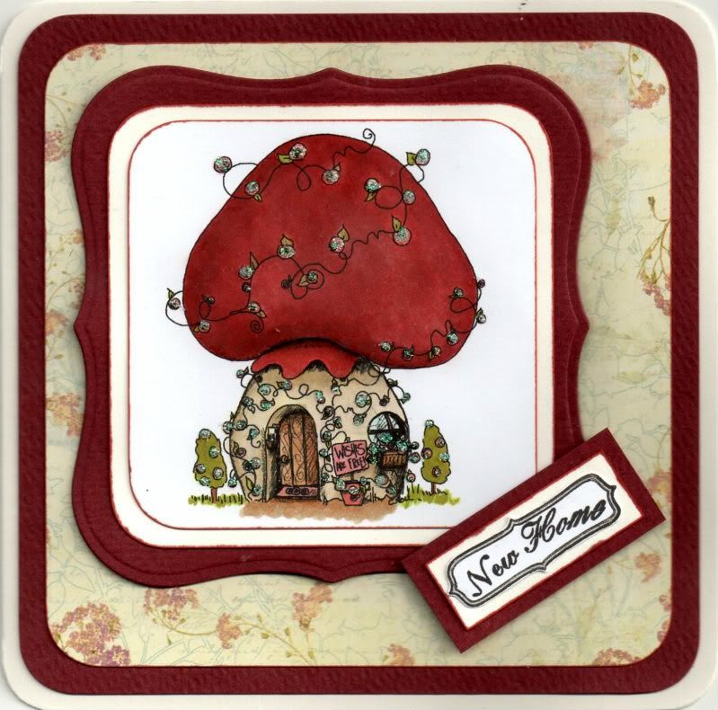
Red and Cream Tiddly Inks Mushroom New Home

I needed to make a New Home card for my friend who has just moved back to Germany. Of course, having made the card, I learnt that there were issues with the new house and so they weren't actually moving into it. But, thankfully all the issues have now been resolved and they can now move out of the hotel and into their new home.


I decided that I would make the New Home card using this cute digi image.

The Mushroom House digi image, from Tiddly Inks, was coloured with Copic Sketch markers:
  • Mushroom Roof: E04, E07, E09, R02, R37, R39
  • Mushroom Base: Y00, Y02, Y11, E40, E41, E43
  • Door: E33, E35, E37
  • Window Frame: E35
  • Window: BG10
  • Grass/Leaves/Trees: YG13, YG95
  • Flowers/Sign/Door Mat: R02
  • Pot: E07
  • Shadow: E35, E43
  • Letters: E40

The corners of the image panel were then punched with the large XCut corner rounder. This was then matted onto a panel of cream card and a panel of deep red card die cut using a Nestabilities Labels 1 die.

A panel of the Cream Floral Script paper from the Prima Botanical paper pad was matted onto the red card, both punched with the corner punch.

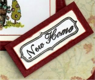
The sentiment panel was created by stamping the curly frame image from the Papermania Tweet stamp set using Versafine Onyx Black archival pigment ink and the sentiment from the Papermania Mix and Match Scrolls and Sentiments stamp was stamped in the centre using the same ink. The frame was cut out and matted onto the cream and red cardstocks.


The flowers on the main image were then highlighted with Craft Planet Iridescent Sparkle glitter glue.

The frame of the sentiment panel was traced around using the clear Sakura Stardust pen.


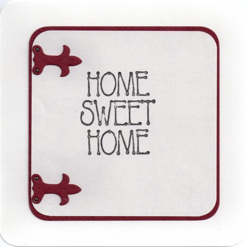
The inside of the card was also decorated, using my much-neglected Sizzix Sizzlits Latches die. The rivets of the latches were coloured using the 110 Copic sketch marker and traced over with the clear Sakura Stardust pen.

Here are the blog challenges I am entering this card into:

Friday, 2 September 2011

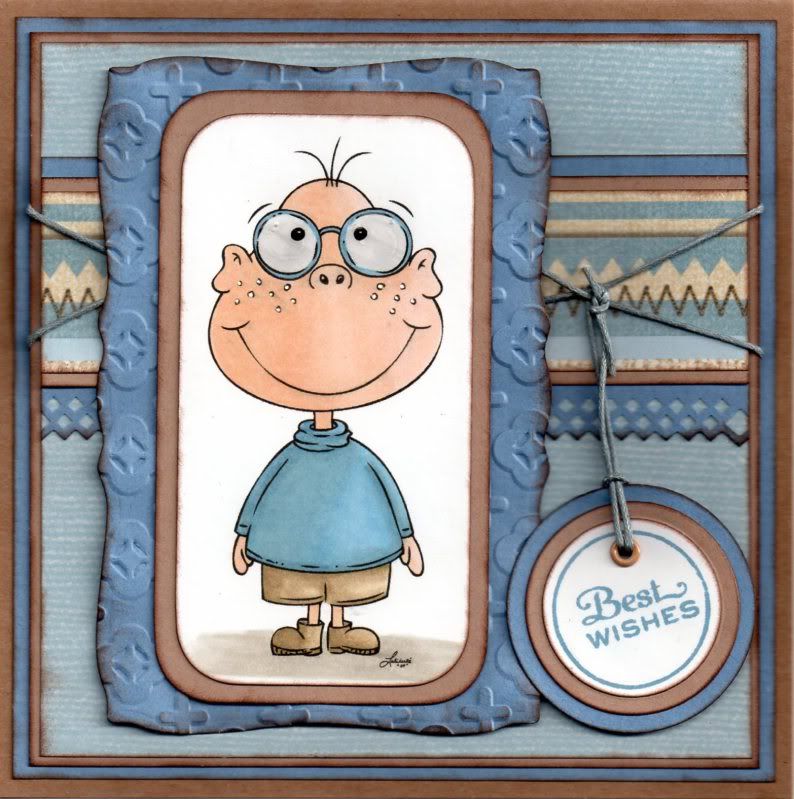
Light Blue and Brown Prairie Fairy Lewis

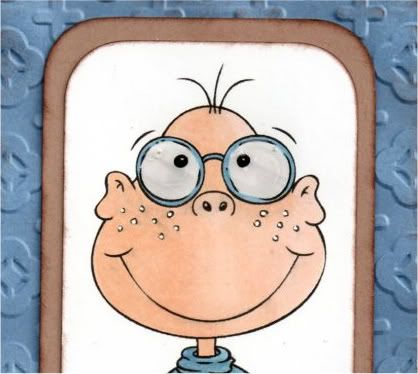
This is one of the many masculine cards I need to make at the moment. I decided to use the amusing digi image of Lewis from the Prairie Fairy.


The image was coloured with Copic markers:
  • Skin: E00, E11, E21
  • Glasses: B45
  • Glass: N1
  • Jumper: B41, B45, B93
  • Shorts/Boots: E41, E43, E44
  • Shadow: W1, W3
Highlights were then added to the cheeks on the image using the Papermania Snow White gel pen.

 The image was then trimmed and the corners rounded with the XCut large corner rounder punch. This was then matted onto a panel die cut using a Mega Curved Rectangle die from Nestabilities that was embossed with the Cuttlebug Moroccan Screen embossing folder.


A strip of the light blue and brown stripe paper from the HOTP Ultimate Cardmaker's Creative Pack was matted onto beige card and a strip of blue paper punched with the XCut Diamonds border punch.

This was added across a panel of the light blue paper from the same paper pad.

A couple of lengths of mid-blue hemp cord were added across the stripe panel and the panel was then matted up onto the card blank.

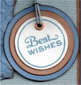
The sentiment, from the Personal Impressions Paula Pascual Mixed Sentiments stamp set was stamped using Tim Holtz Faded Jeans distress ink and die cut using a classic circle Nestabilities die and matted onto circles of the beige card and blue paper.


A small beige eyelet was added to the tag and threaded with the blue hemp cord and tied to the cord across the card.

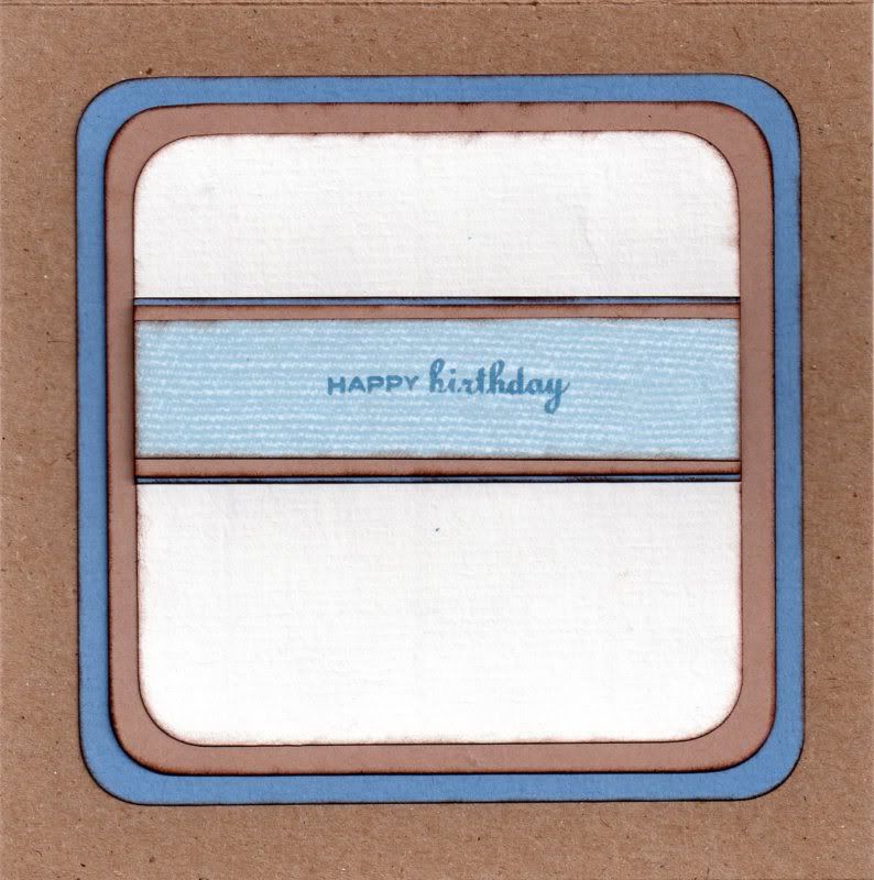
I also decorated the inside of the card, using the same papers as the front of the card and the sentiment, from the Personal Impressions Paula Pascual Mix and Match Sentiments stamp set, was stamped across the patterned paper using the Faded Jeans ink.


Here are the blog challenges I am entering this card into:
Blog Widget by LinkWithin