So, with that in mind, I'm daring to post the anniversary card that I've made for our 10th Wedding Anniversary that we will be celebrating in December. I'm trying to get ahead with my 'normal' cards so that I can make a start on my Christmas cards and not have to worry that I haven't got my cards made for January after the holidays.
Anyway, apart from the imminent 'New Baby' card that is due to be made for the end of November, I am now up to date with my 'normal' cards, with them all made up to the end of January. Tomorrow, the big tidy up can commence in my craft room and I can get my Christmas stash out!!
So, this was the last card to be made, and hopefully it will go down well!
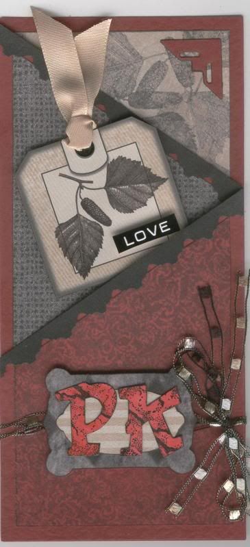
The card blank is deep red hammer card, and was folded to make a zigzag card. The patterned papers are from the Hot Off The Press (HOTP) Classic Creative Cardmakers Pack. The chosen papers were cut to shape and the edges inked with a black inkpad.
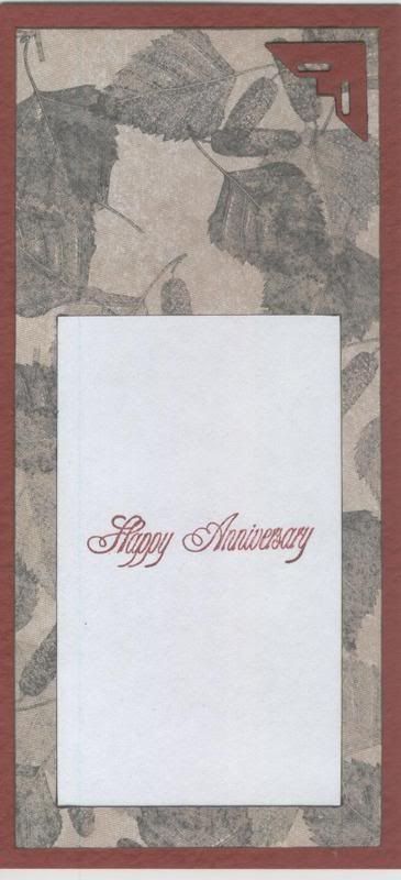
For the back page, I took the rectangle of patterned paper, and cut out a frame from the lower half. A piece of white paper was attached behind the frame, giving an area on which to stamp the greeting. The positioning of the frame ensures that it cannot be seen when the card is closed. A photo corner was cut from matching deep red hammer card using the Ellison Photo Corners Thin Cut die.
The other patterned paper panels were attached to the card blank, and punched border strips were then added along the cut edges. These are actually the waste from the lace borders that I added to the pink/black anniversary cards I made the other week using the Fiskars Lace Border punch, and thought these would come in handy for another project - and I was right. These are a lot less fussy and feminine than the lace part, and I think they work with the design.
The tag is artwork included in the HOTP Classic Creative Pack, which was simply cut out, and a black eyelet added (using my now very trusty Big Bite!) and some beige ribbon threaded through. A HOTP Word Fragment was 3D'd to the tag, and this was then adhered to the second panel of the card.
On the front panel, I used my HOTP Labels template to create the name plaque, using matching papers from the HOTP Classic Creative Pack. The letters are from the ColorBok Alphabet set. They are white paper letter die cuts that were coloured using the Brilliance Rocket Red pigment ink and over stamped using the Brilliance Graphite Black pigment ink and the Stone Texture stamp from the Judikins Artifacts cube.
Four lengths of brown ladder ribbon were attached to the front panel and the name plaque, complete with monograms (our initials) was added over the top of the ends of the ribbon.
I am entering this card into the Double Dutch Blog Challenge, the current challenge being to use only three techniques from the list on their blog.
The three techniques I have used are:
STAMPING
PUNCHING
EMBELLISHMENT MAKING
Head over there to see what the design team have come up with, and enter your creation.





















2 comments:
This is lovely Kathleen, I'm impressed with the colours you've chosen and it's a fab layout! xx
Hey Kathleen, me again! You've been tagged! x
Post a Comment