Pages

WELCOME

This blog was created to act as a record of the cards and other projects that I have made. It is for both my own reference and to help inspire anyone who wants to take a look.

I'd love it if you'd leave me a comment so that I know what you think of my projects and that you've been to visit!

Anyone can comment, even those who don't have a blog. (Just look for the word 'Comments' under the three little pictures at the end of each post). Readers without a blog can add an anonymous comment, but please leave your name (and docrafts username if applicable) so I know who you are!

Slideshows of all the cards I've uploaded to my blog can be found at the bottom of the page.


PEOPLE WHO FOLLOW MY BLOG

Showing posts with label ColorBok. Show all posts

Sunday, 15 August 2010

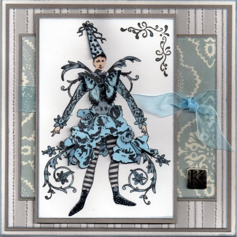
Blue and Grey Pantaloon

This is the card that I made for the very talented Katy (CraftyKaty) for her birthday. She seems to be going through it a bit at the moment and I hope this cheered her up a little. She is a tremendously talented cardmaker and I knew I had to make an extra-special card to be worthy of sending it to her!!! Please head over to her blog to see her amazing creations.

I hope no-one minds me entering it into quite so many challenges, but I'm rather proud of this one and want to show it off as much as possible!!!


The image, from Stampington & Co, is called Pantaloon, and was stamped onto white card using Memento Tuxedo Black dye ink and coloured using Copic sketch markers:
  • Skin: E00, E51
  • Hat/Dress: B41, B45, BV23, N1
  • Tights: N1, BV23
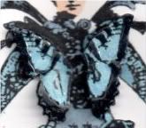
The image was stamped again and the butterfly, dress and hat were coloured and cut out and decoupaged over the base image.

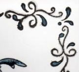
The corner swirl image, from the Studio G Friends For Life mini stamp set, was stamped in the top right corner with Versafine Onyx Black archival pigment ink and coloured with the Copic markers:
  • Swirl: B41, B45, BV23, N1
I traced over the swirl section with the N1 marker, giving it a sort of shadow effect.


The image was layered up and Anita's 3D gloss was added to the spots on the hat, the shoes and the butterfly markings.


This panel was matted onto dark grey card.

A panel of the grey ribbon stripe paper from the Papermania Monochrome Capsule Collection paper pad was also matted onto the grey card, as was a panel of the light blue medallion paper from the Papermania Persimmon paper pad.

A length of light blue organza ribbon was tied around the light blue panel and a square 'K' brad, from the ColorBok Alpha Accents kit was added in the bottom right hand corner. The three layers were then matted up.

Colour was added to the brad using a Copic marker (B45) to tie it in with the rest of the card.

Tuesday, 3 March 2009

Peacock Blue Traveller Edwin

I finally got my table back up yesterday and managed to make a birthday card for my 'little' brother (he's 25 this year!!!). I think I might have to get more of my stash out and down than I'd hoped as it's completely unworkable as it is. I'm having to move everything slightly just so I can get something out. It's a complete nightmare!!!


Anyway, here is my creation. I love these colours at the moment, and I'm really pleased with my watercolouring on the Edwin image, even if I do say so myself!!!

The Edwin image, 'Traveller Edwin', was kindly donated by Alex K (Eisbaerin).

Edwin was watercoloured using the Whispers Brushstroke markers and highlighted with white gel pen. The wings were then highlighted with Craft Planet Iridescent Sparkle glitter glue.

A curvy frame was cut from peacock blue cardstock from the DCWV Brights mat stack, and matted over a piece of green cardstock embossed using the Cuttlebug 'Spots and Dots' folder (kindly donated by Tara W (Kania)). The Edwin image was cut out and 3D'd onto the frame.

A wavy mat was cut from a patterned paper from the HOTP Ultimate Creative Pack and a strip of matching paper was adhered across it. This was then matted onto the peacock blue card from the DCWV Brights mat stack.

Two tickets from the Autumn Leaves Tickets stamp set were stamped using ColorBox Prussian Blue Fluid Chalk ink onto the matching piece of paper from the HOTP paper and cut out. These were edged with ColorBox Prussian Blue Fluid Chalk ink and highlighted with white gel pen, then attached to the mat beneath the frame.

A letter 'D' from the Colorbok Letters set was coloured using ColorBox Celadon Pigment ink and edged with ColorBox Prussian Blue Fluid Chalk ink. Highlights are added using white gel pen. A teal blue button was threaded with a matching fibre from the HOTP Sarabooks Sapphire fibre pack and both were attached to the bottom right hand side of the card.

Thursday, 6 November 2008

DH's Anniversary Card For Our 10th Anniversary

I am taking a huge risk posting this on here. DH (Phil) hasn't had a look on here since I started this blog. He occasionally asks me what it is that I post on here, and stares at me with that look of incredulity (you all know the one) when I get excited that someone has left a comment, or I hit another 100 views on my blog counter.

So, with that in mind, I'm daring to post the anniversary card that I've made for our 10th Wedding Anniversary that we will be celebrating in December. I'm trying to get ahead with my 'normal' cards so that I can make a start on my Christmas cards and not have to worry that I haven't got my cards made for January after the holidays.

Anyway, apart from the imminent 'New Baby' card that is due to be made for the end of November, I am now up to date with my 'normal' cards, with them all made up to the end of January. Tomorrow, the big tidy up can commence in my craft room and I can get my Christmas stash out!!

So, this was the last card to be made, and hopefully it will go down well!

The card blank is deep red hammer card, and was folded to make a zigzag card. The patterned papers are from the Hot Off The Press (HOTP) Classic Creative Cardmakers Pack. The chosen papers were cut to shape and the edges inked with a black inkpad.

For the back page, I took the rectangle of patterned paper, and cut out a frame from the lower half. A piece of white paper was attached behind the frame, giving an area on which to stamp the greeting. The positioning of the frame ensures that it cannot be seen when the card is closed. A photo corner was cut from matching deep red hammer card using the Ellison Photo Corners Thin Cut die.


The other patterned paper panels were attached to the card blank, and punched border strips were then added along the cut edges. These are actually the waste from the lace borders that I added to the pink/black anniversary cards I made the other week using the Fiskars Lace Border punch, and thought these would come in handy for another project - and I was right. These are a lot less fussy and feminine than the lace part, and I think they work with the design.

The tag is artwork included in the HOTP Classic Creative Pack, which was simply cut out, and a black eyelet added (using my now very trusty Big Bite!) and some beige ribbon threaded through. A HOTP Word Fragment was 3D'd to the tag, and this was then adhered to the second panel of the card.

On the front panel, I used my HOTP Labels template to create the name plaque, using matching papers from the HOTP Classic Creative Pack. The letters are from the ColorBok Alphabet set. They are white paper letter die cuts that were coloured using the Brilliance Rocket Red pigment ink and over stamped using the Brilliance Graphite Black pigment ink and the Stone Texture stamp from the Judikins Artifacts cube.

Four lengths of brown ladder ribbon were attached to the front panel and the name plaque, complete with monograms (our initials) was added over the top of the ends of the ribbon.


I am entering this card into the Double Dutch Blog Challenge, the current challenge being to use only three techniques from the list on their blog.

The three techniques I have used are:
STAMPING
PUNCHING
EMBELLISHMENT MAKING

Head over there to see what the design team have come up with, and enter your creation.
Blog Widget by LinkWithin