Pages

WELCOME

This blog was created to act as a record of the cards and other projects that I have made. It is for both my own reference and to help inspire anyone who wants to take a look.

I'd love it if you'd leave me a comment so that I know what you think of my projects and that you've been to visit!

Anyone can comment, even those who don't have a blog. (Just look for the word 'Comments' under the three little pictures at the end of each post). Readers without a blog can add an anonymous comment, but please leave your name (and docrafts username if applicable) so I know who you are!

Slideshows of all the cards I've uploaded to my blog can be found at the bottom of the page.


PEOPLE WHO FOLLOW MY BLOG

Showing posts with label Paper Artsy. Show all posts

Saturday, 30 July 2011

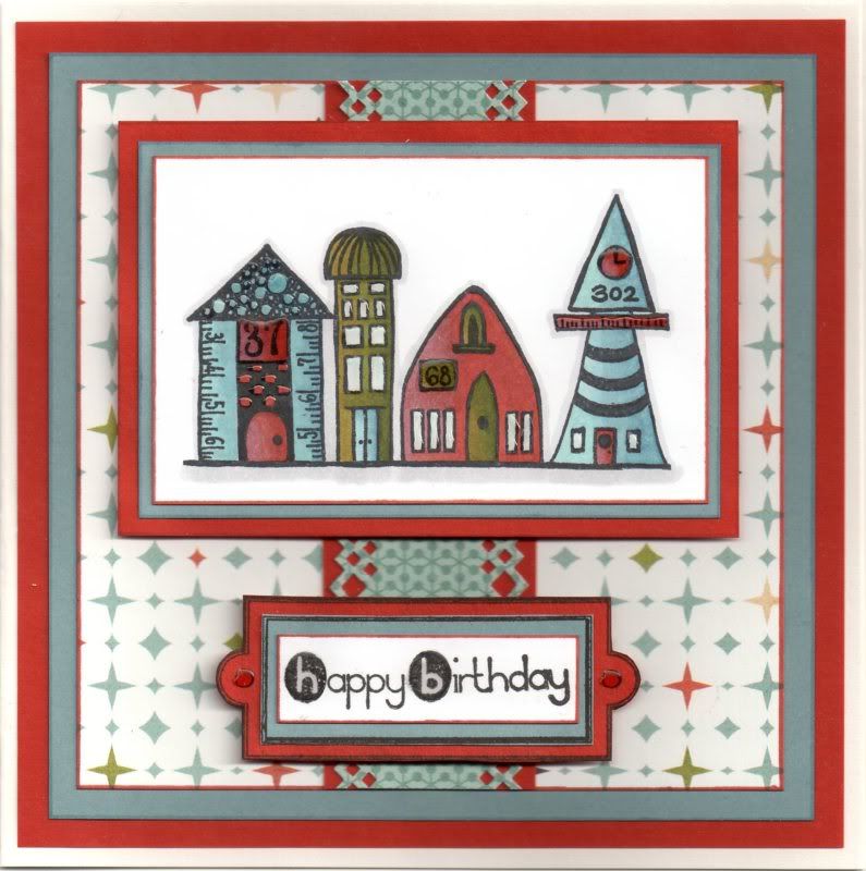
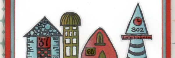
Blue, Rust and Olive Paper Artsy Houses

This is the first time I've used this stamp set. I know - it's terrible as I've had it a while now and only got around to mounting it up yesterday.


This is the card I have made for my father-in-law. I figured he'd had enough cutesy character cards of late and decided I'd dig these stamps out. I've loved them for ages and have seen some lovely cards using them.

The line of houses image, from the Paper Artsy Bricks and Mortar 2 stamp set, was stamped using Memento Tuxedo Black dye ink and coloured with the Copic sketch markers:
  • Houses 1 & 4: B41, B45, B93, BG11, N1, E04, E07, E09
  • House 2: G99, YG17, YG95, BG11, B41, B45, B93
  • House 3: E04, E07, E09, G99, YG17, YG95
  • Windows: BG10
  • Outline/Shadow: N1
Houses 1 and 4 took some adjusting as I didn't really have a colour to match the paper so I tried blending with the grey and the blue/green to try and get as close a match as I could. I think it worked.


The image was then matted onto blue and rust paper.

A strip of the Light-Hearted paper from the Basic Grey Offbeat paper pad was punched along both edges using the XCut Diamonds border punch and matted onto the rust paper. This was then matted onto a panel of the Alternative paper from the same paper pad, which in turn was matted onto the blue and rust papers.

The image panel was then matted towards the top of the panel.
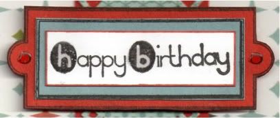

To create the sentiment panel, the rectangular bookplate image from the Stamps Away Bookplates, Photo Corners and Anchors stamp set was stamped onto the rust and blue papers using Versafine Onyx Black archival pigment ink and layered up. The sentiment, from the Dovecraft Make A Wish mini stamp set, was then stamped onto the white card using the Onyx Black ink and matted on top.

The sentiment was then added below the image panel.

Highlights were then added to the image and the sentiment panel with Ranger Glossy Accents.
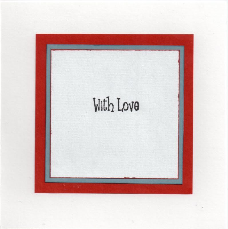

The inside was also decorated using the blue and rust papers, and the sentiment, from the Papermania Clare Curd Sentiments stamp set stamped with the Onyx Black ink.

Here are the blog challenges I am entering this card into:

Monday, 27 June 2011

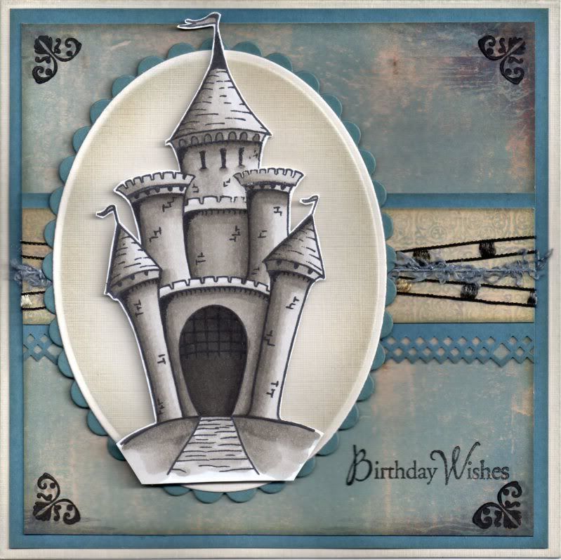
Blue and Grey Paper Artsy Castle

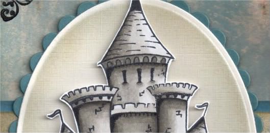
So, as promised, here is the card I made using the Castle stamp from the Paper Artsy Crowns and Castles 4 stamp set.


The Castle image was stamped using Memento Tuxedo Black dye ink and coloured with Copic markers:
  • Castle: W1, W3,W5,W7,W9
The image was then cut out.

Using Nestabilities dies, a petite cream oval and petite scalloped blue oval were die cut. Keeping the cream die cut within the die, the edges were distressed using Tim Holtz Weathered Wood and Antique Linen distress inks with shaving brushes. I much prefer the effect using the brushes to the Cut & Dry foam as I always get heavy smudges when I use the foam, whereas this gives a much softer look.

The Castle image was then mounted in the centre of the ovals.

A panel of the cream and blue medallion paper from the DCWV Once Upon A Time mat stack was then matted onto a strip of the blue card punched with the XCut Diamonds border punch and lengths of brown ladder ribbon and blue fibre from the HOTP Sapphire Sarabooks fibres were wrapped around it.


This was then matted across the blue distressed birds paper from the same mat stack. The edges of all of these pieces were distressed with the two distress inks and then matted onto blue card.

The corners of the blue distressed paper were then stamped using a small corner flourish stamp from the Fiskars Friends Forever Quotes stamp set and Versafine Smokey Gray archival pigment ink and then overstamped with Brilliance Graphite Black pigment ink.

The Birthday Wishes sentiment, from the Hero Arts Birthday Messages stamp set, was stamped in the bottom right corner also using the Graphite Black ink.

Here are the challenges I am entering this card into:

Monday, 16 May 2011

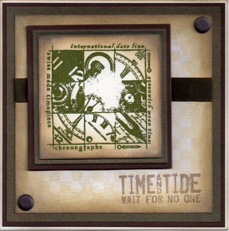
Green and Brown Time and Tide Collage Repost

Another of my masculine cards now for you. This one didn't actually stamp out properly but thought it might look like it was supposed to look like that!!! Well, that's my excuse!!


The Time Piece Collage image, from the Paper Artsy Clocks 3 stamp set, was stamped using Papermania Olive Green ink and heat embossed with Heat It Up! Moss embossing powder. The image was then die cut using a standard square Nestabilities die and distressed using Tim Holtz Antique Linen and Walnut Stain distress inks. This was then matted onto squares of green glimmer paper and brown card.

A panel of the beige and cream chequerboard paper from the HOTP Earth Tones Cardmaker's Creative Pack was distressed around the edges using the Antique Linen and Walnut Stain distress inks. The sentiment, also from the Clocks 3 stamp set, was stamped in the lower corner of the patterned paper using the Versafine Vintage Sepia archival pigment ink and a length of brown woven ribbon was adhered across the centre of the panel.

The patterned panel was matted onto the green paper and brown card. The image panel was then added over the ribbon and two brown card candy from Craftwork Cards were added in diagonal corners.
I did enter this card into lots of challenges but as Blogger decided to delete this post, I'm reposting the original version I had saved witohut all the challenges - hopefully Blogger will restore the latest version, but knowing my luck they won't as I had it saved before. This also means I have no idea which challenges I entered - D'oh!!

Here are the ones I've found:

Friday, 26 November 2010

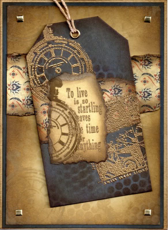
Blue and Brown Timepiece Tag

This is a something a little bit different from me - stamping, embossing and distressing. It's the first time I've used sequin waste as a stencil!!

A blue luggage tag was distressed using a combination of Antique Linen, Frayed Burlap and Walnut Stain Tim Holtz distress inks. The Antique Linen and Walnut Stain inks were used to colour through a piece of sequin waste and then the tag was overstamped with the Pocket Watch stamp from the Paper Artsy Clocks 3 stamp set with the Antique Linen ink.


A strip of the Oxford paper from the Basic Grey Boxer paper pad was colour distressed with the three brown Tim Holtz inks and the edges curled. This was matted across the tag and overstamped with the Pocket Watch stamp and the Time Piece Collage stamp, also from the Clocks 3 stamp set, and gold embossed.

The 'To Live Is Startling...' sentiment, also from the Clocks 3 stamp set, was stamped onto the Commando paper from the same paper pad and gold embossed. This was then overstamped with the Pocket Watch image using the Walnut Stain ink. The image was then torn out and the edges distressed with the brown inks. A large gold eyelet was set in the top of the tag and threaded with string, which was coloured with the Walnut Stain ink.

A larger panel of the Commando paper was distressed with the Antique Linen and Walnut Stain inks and the Pocket Watch image was stamped over it with the Antique Linen ink. This was also used to colour through the sequin waste.

Another strip of the Oxford paper was distressed and matted across the stamped panel. This was matted onto blue card and gold square brads from Dovecraft were added in the corners.

Here are the blog challenges I'm entering with this card:

Wednesday, 22 September 2010

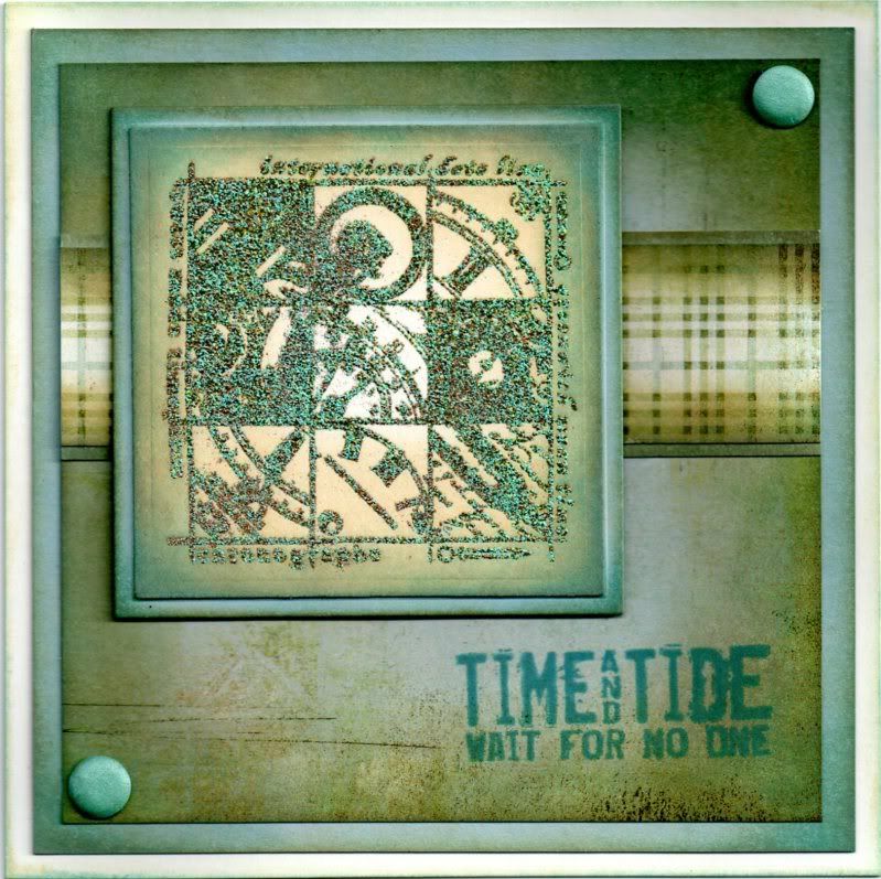
Blue and Green Time and Tide Collage

Thought I should upload one of the many masculine cards I seem to have been making lately. This one is using the great Time Piece Collage stamp from the Paper Artsy Clocks 3 stamp set. I'm hoping I'll get quite a bit of use from this stamp - it looks great in lots of different colours.


The Time Piece Collage image was stamped using Papermania Olive Green ink and heat embossed with Heat It Up! Verdigris embossing powder. The image was then die cut using a standard square Nestabilities die and distressed using Tim Holtz Antique Linen, Broken China and Frayed Burlap distress inks. This was then matted onto a square of blue card also distressed with the inks.

A panel of the Boulder paper from the Basic Grey Archaic paper pad was distressed around the edges using the same distress inks, as was the strip of the Bygone Plaid paper, from the same paper pad. The plaid paper was matted onto blue card and across the Boulder paper.

The sentiment, also from the Clocks 3 stamp set, was stamped in the lower corner of the patterned paper using the Broken China distress ink.

The image panel was added over the plaid paper and two aqua card candy from Craftwork Cards, colour distressed with the Broken China and Frayed Burlap inks, were added in diagonal corners.

I will be entering this card into a few blog challenges:

This week's Tuesday Taggers Challenge is sponsored by Ribbon Oasis

Blog Widget by LinkWithin