Pages

WELCOME

This blog was created to act as a record of the cards and other projects that I have made. It is for both my own reference and to help inspire anyone who wants to take a look.

I'd love it if you'd leave me a comment so that I know what you think of my projects and that you've been to visit!

Anyone can comment, even those who don't have a blog. (Just look for the word 'Comments' under the three little pictures at the end of each post). Readers without a blog can add an anonymous comment, but please leave your name (and docrafts username if applicable) so I know who you are!

Slideshows of all the cards I've uploaded to my blog can be found at the bottom of the page.


PEOPLE WHO FOLLOW MY BLOG

Showing posts with label tag. Show all posts

Friday, 13 November 2015

Green and Grey Chester Pocket Card

This is a different type of card for me. It is based on a project that I found on the Splitcoaststampers tutorials page here, a Pocket Card.

With this design of card, the card doesn't actually open, but the sentiment and handwritten greeting go onto a tag that is placed within the pocket section of the card.
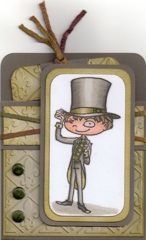
 
 
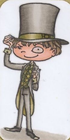
To begin with, the image, Chester by Kraftin' Kimmie, was stamped using Memento Tuxedo Black dye ink and coloured using Copic markers.
 
Copics:
Skin: E00, E11, E21
Hair: E41, E43, E44
Hat/Jacket/Trousers: W1, W3, W5, W7
Hat Band: YG91, YG95, YG99
Tie: G99
Waistcoat: YG95, G99
Inside Jacket: YG91, YG95
Shirt: YG91
Shoes: W5, W7, YG91
Shadow: W1, W3
Outline: W1
 
 
The image panel was then matted onto green and then grey cardstock.
 
The next step was to create the Pocket Card.
 
A piece of card measuring 4" x 11" was then scored in half and then scored again 1.25" from one edge. A panel of white card was embossed using the Cuttlebug Fleur de Lis embossing folder and distressed with Tim Holtz Crushed Olive and Forest Moss distress inks. This panel was adhered to the large front panel of the card. A smaller strip of white card was also embossed and inked with the Crushed Olive and Forest Moss inks and this panel was then adhered to the front flap panel.
 
A couple of lengths of green fibres from the HOTP Sarabooks Emerald Fibres set were then wrapped around the front flap and the flap then adhered down to the front panel.
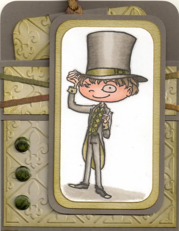
 
 
Three green card candi were then coloured using the G99 Copic marker and added to the front panel, as was the image panel. Glossy accents were added to the monocle in the image.
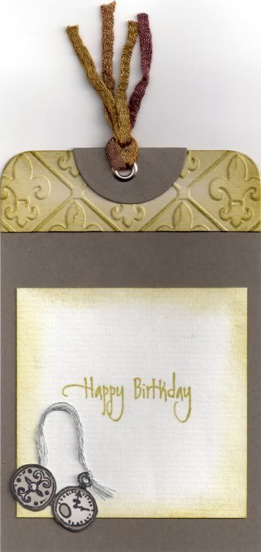
 
 
To complete the card, a tag was created. A strip of the embossed and coloured white card was added across the top of the tag, as was a circle of grey cardstock, diecut using a Nestabilities circle die, and then folded in half.
 
A silver eyelet was set in the top of the tag and more of the green fibres were threaded through it.
 
The pocket watch image was stamped using the Tuxedo Black ink and coloured with the W1, W3 and W5 Copic markers. A length of silver embroidery thread was threaded through the image and added to the tag. The sentiment, from the Elzybells Swirly Sentiments stamp set was stamped onto the tag using Versafine Spanish Moss archival pigment ink.
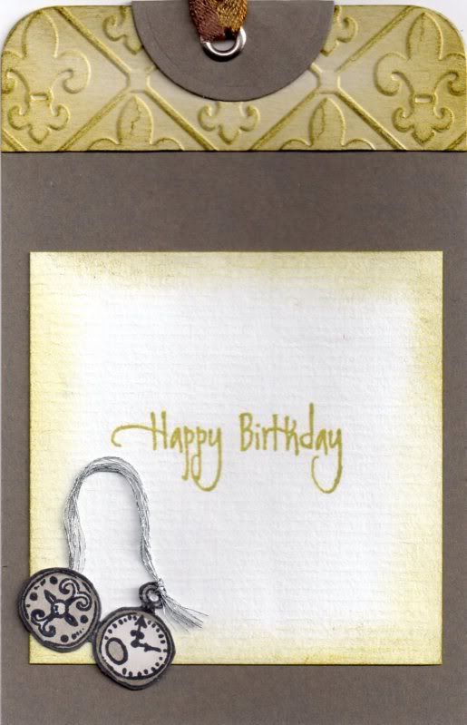
 
 
The tag was then slotted into the pocket on the front of the card.

Saturday, 31 October 2015

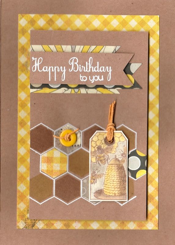
Yellow and Kraft Bee and Honeycomb Masculine

Time for a masculine card I think.

This was the card that I made for my father-in-law this year. It actually came together rather well and I was pretty pleased with it. Especially the colouring!
 
 
This card uses my much-coveted yet much under-used honeycomb stamp and die set.
 
 
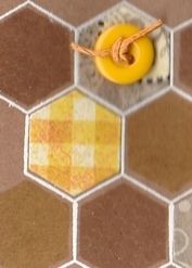
So, to begin this card, the honeycomb image from the Clearly Besotted Honeycomb stamp set was stamped onto Kraft card using Versamark ink and heat embossed using Stampendous Opaque White detail embossing powder. Using Versafine Toffee and Vintage Sepia archival pigment inks, the honeycomb hexagon and the solid hexagon from the same stamps set were stamped into the honeycomb framework. To complete the honeycomb image, honeycomb pieces were die cut from the gingham paper, spotty paper and the floral paper from the Authentique Blissful paper pad using the Clearly Besotted Honeycomb die.
 
 
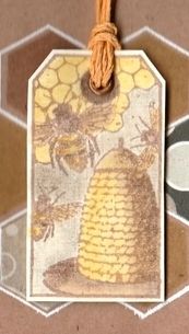
The next stage was to create the tag. The bee skep tag stamp from the Invoke Arts Nature Tags stamp set was stamped using the Vintage Sepia ink and coloured using pencils from the WHSmith tin of pencils, including the white to add highlights. This was then cut out and a metallic Papermania eyelet added and threaded with a length of yellow hemp cord. This, along with a yellow button also tied with the same hemp cord were added to the honeycomb.
 
 
The sentiment, also from the Honeycomb stamp set was stamped in Versamark and white heat embossed onto Kraft card. This was hand cut into a fishtail banner and adhered to the panel over fishtail banner pieces cut from papers also from the Blissful paper pad.
 
The panel was then adhered to a panel of the yellow gingham paper and then to the card front.
 
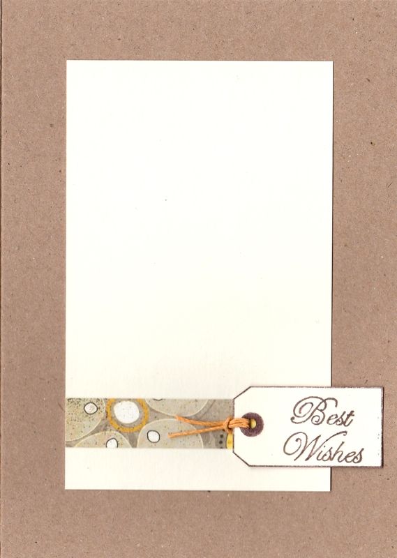
The inside of the card was also decorated using just a strip of matching patterned paper and a tag.
 
 
The tag was created by only inking up the edge of the tag and the eyelet feature with a brown pen and stamping out. The sentiment, from the See D's Celebration Messages stamp set, was stamped using the Vintage Sepia ink within the tag shape and fussy cut out. The tag was threaded with the yellow hemp cord and added to the inside of the card over the patterned paper.
 

Saturday, 24 October 2015

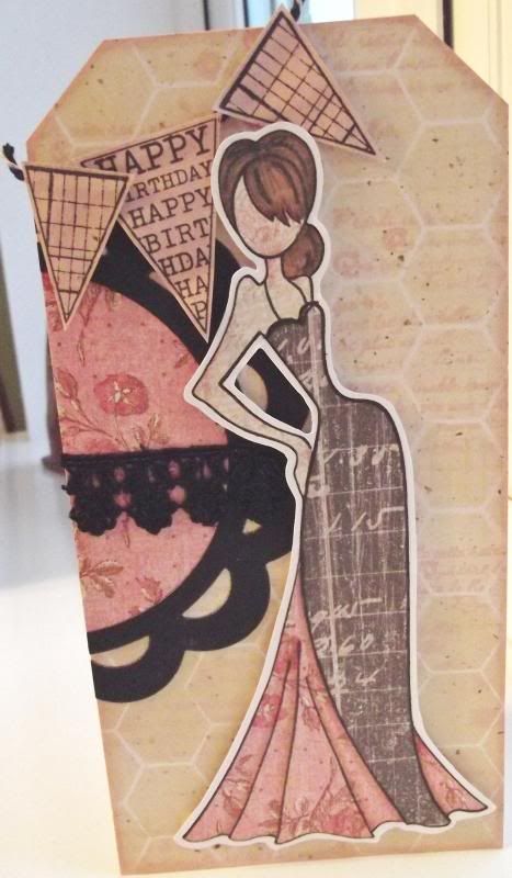
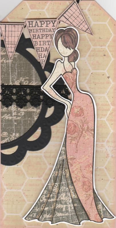
Pink Black and Beige Paper-Pieced Prima Doll

I should begin by apologising for the picture quality of this card. Normally I scan my cards in but my scanner had decided to give up the ghost (well, actually the printer had, and so the scanner just played along). Anyway, these were photographed and I couldn't find my mini tripod so getting up close and holding the camera perfectly steady wasn't easy!!

This card shows my first attempt at using my Prima Doll stamp Tasha. I actually made it at the cardmaking group that I go to and it was great fun.
Paper-piecing the image is actually very simple to do. The hard part is choosing which papers to use.
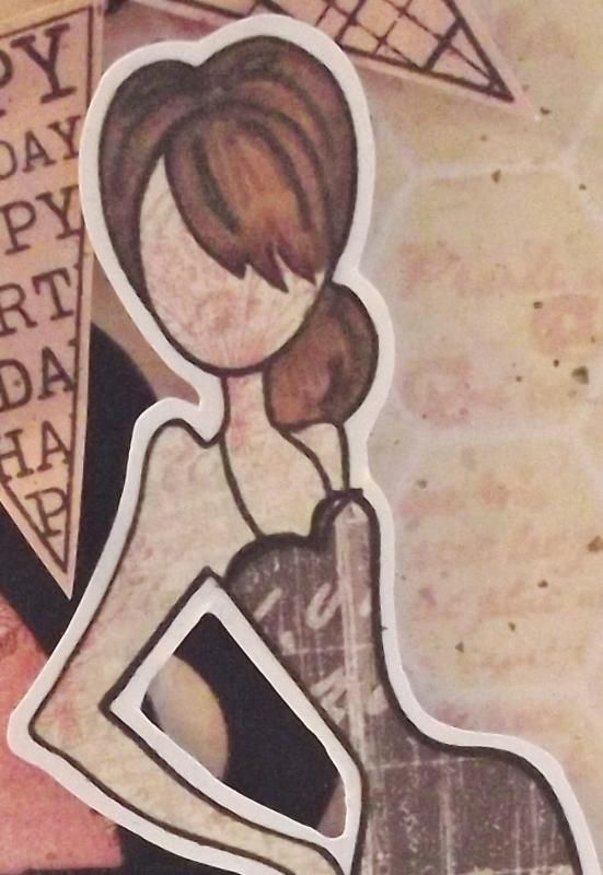
I began by stamping the whole image onto some white card using Memento Tuxedo Black dye ink. The image was then stamped again onto three different patterned papers from the K&Co Best of Too paper pad, using papers from the Life's Journey and K-Ology Hannah collections. I do love this paper pad, and it is much underused. I really should get it out more. The next stage was to cut the various pieces from the different papers and assemble them onto the base image. The hair was coloured onto the patterned paper using Promarkers.

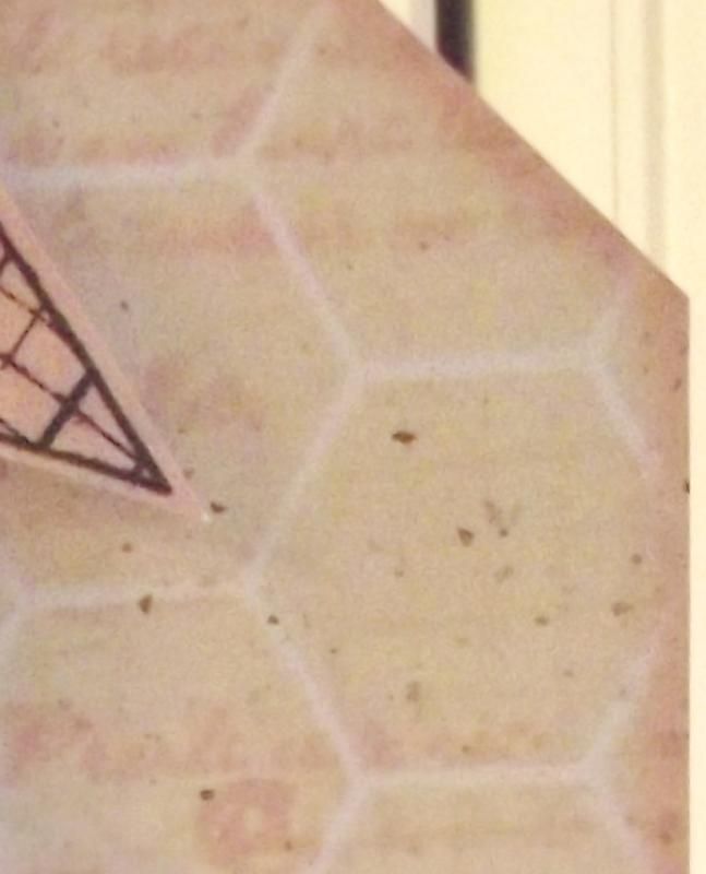
The next stage was to create a background for the image to sit on. I started with a piece of 'natural' paper which has tiny flecks in it. I then taped the Memory Box Chicken Wire stencil over the piece and sponged through Tim Holtz Antique Linen distress ink. Once that was done, with the stencil still in place, the French Text stamp from the Bo Bunny It Is Written stamp set was stamped through the stencil using the Tattered Rose ink. This was matted to the front of a DL card blank that was cut into the shape of a tag.

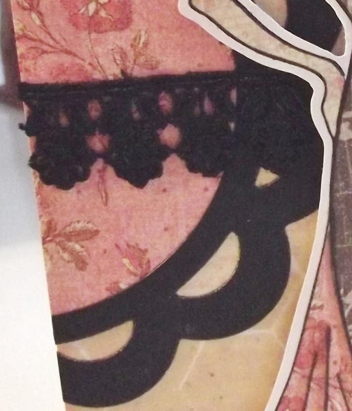
In order to create a bit more interest behind  the doll image, the Marianne scalloped circle frame was diecut from black card and a circle of the pink patterned paper used on the dress was diecut to fit within it. A length of black lace was wrapped around the circle and matted together on the edge of the tag and the excess cut away.


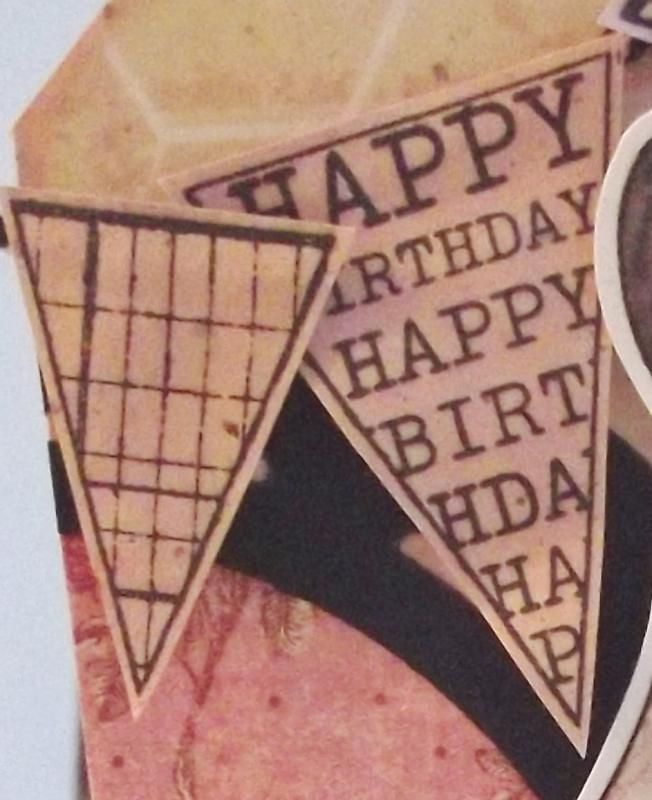
I then wanted to add a sentiment to the card and decided to use the banner stamps from the Hero Arts Friendly Flags stamp set. These were stamped onto the inked natural paper, inked with the Antique Linen and Tattered Rose inks. These were cut out and adhered to black and white Gorjuss Baker's Twine in the top left corner.


I also made a second card using the other parts of the stamped image.

Wednesday, 21 September 2011

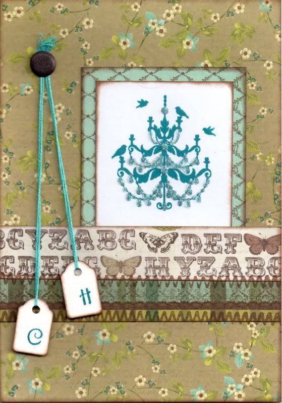
Brown and Blue Floral Chandelier Tags Anniversary

This is a second version of the anniversary card I made recently using the Chandelier stamp that came free with the July 2011 issue of Craft Stamper Magazine.


I went for more muted tones with this version, using one of my favourite colour combinations of blue and brown.

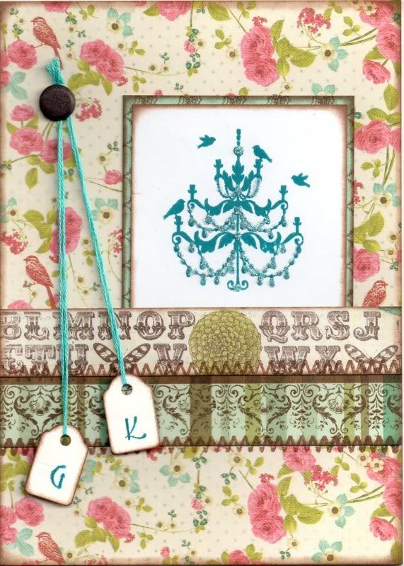
The Chandelier image was stamped using Adirondack Stream dye ink and matted onto the blue diamonds paper from the Prima Madeline paper pad.


The card blank was completely covered with the Brown Script Floral paper from the same paper pad and the image panel added to the right.

A strip of the Alphabet paper was added to a strip of the Multi Border paper and this was then added over the image panel. Faux stitching was then added over the joins of the paper pieces using the Zigzag Stitch stamp from the HOTP Stitches stamp set and ColorBox Chestnut Roan Fluid Chalk ink.

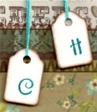
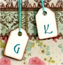
Two mini tags were coloured around the edges using the Chestnut Roan ink and letters were stamped using the Stream ink and a Studio G mini alphabet stamp set. The tags were attached to some teal embroidery thread and added to the card and a brown Card Candi from Craftwork Cards was added over the ends of the threads.


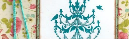
Highlights were added to the Chandelier image using Glossy Accents and DecoArt Crystal Glamour dust.
All papers were distressed with the Chestnut Roan ink.

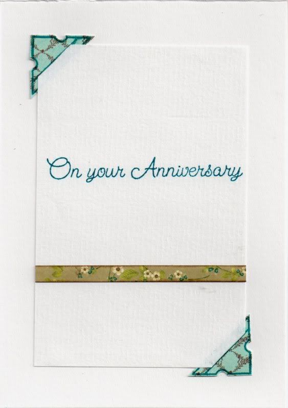
The inside of the card was also decorated using a photo corner stamp from the Stamps Away Bookplates, Corners and Anchors stamp set, stamped onto the blue diamonds paper used on the front of the card using the Stream ink and cut out


Slits were cut into the photo corners and the writing paper inserted into the corners, and a strip of the Brown Script Floral paper used on the front of the card was added across the paper and the sentiment, from Elzybells, was stamped using the Stream ink.

Here are the blog challenges I am entering this card into:

Monday, 5 September 2011

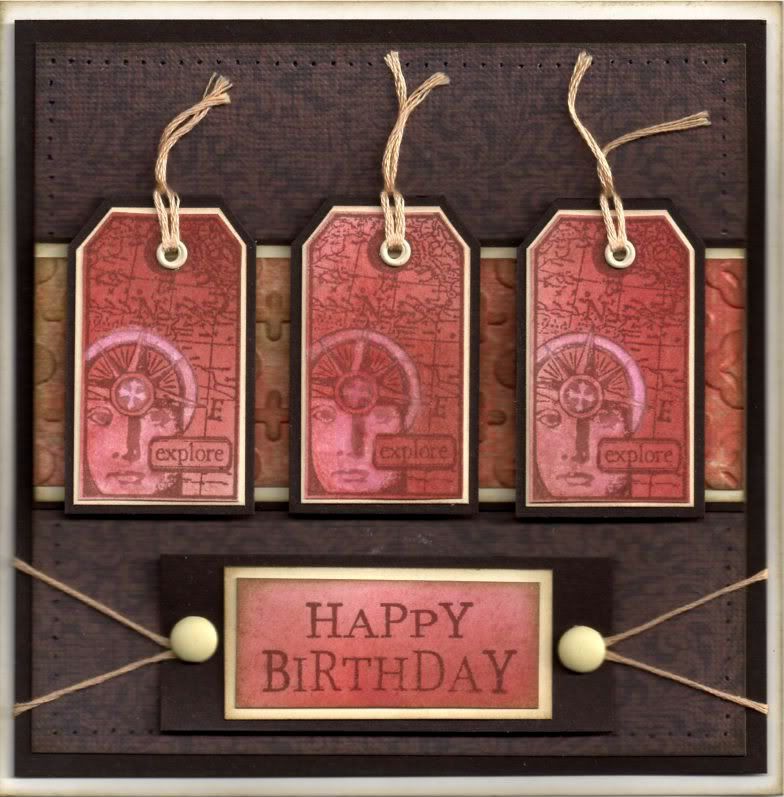
Red and Brown Explore Invoke Arts Tags

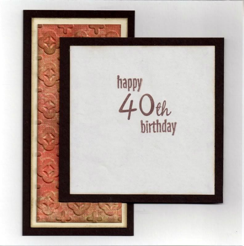
Well, here is the first of the masculine 40th birthday cards that I need to make. Got to get my thinking cap on for the second one now!


A piece of white card was coloured using Tim Holtz Fired Brick, Aged Mahogany and Frayed Burlap distress inks using the shaving brushes.

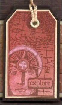
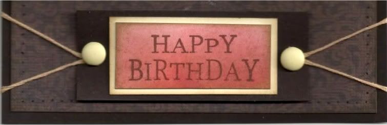
This was then overstamped with the Explore tag from the Invoke Arts Travel Tags stamp set and the 'Happy Birthday' sentiment stamp from the See D's Celebration Messages stamp set. All were stamped using Memento Rich Cocoa Dye ink.

Using a damp paint brush and a piece of tissue (OK, toilet roll, but I couldn't be bothered going downstairs to get a tissue!!), some of the colour was removed from the face image on the tag. Areas of the compass were then lightly coloured using the Angel Green Mica Pigment from Stamps Away. Unfortunately that doesn't show up on the scan.

The tags were then cut out by hand and matted onto cream card and dark brown card. Holes were punched in the top of each tag using the Big Bite and small cream eyelets from Papermania were set in the holes. Each hole was then threaded with cream embroidery thread.


The sentiment was also matted onto cream and dark brown cardstock and large cream brads from Papermania were added either side of the sentiment, with a length of cream embroidery thread threaded through the legs of the brads.


A strip of the red/brown paper from the DCWV Old World mat stack was embossed using the Moroccan Screen embossing folder from Cuttlebug and Frayed Burlap ink was added to highlight the embossing using Cut 'n' Dry foam.

This was then matted onto cream and dark brown card and then matted across a panel of the dark brown flourish paper from the same paper pad.

Once matted onto the dark brown cardstock, the panel was then paper pierced all the way around using the Stampin' Up Mat Stack piercing template.


The tags were adhered onto the card in the centre over the embossed strip and the sentiment was added beneath, wrapping the lengths of embroidery thread behind the panel before adhering to the card front.

The inside of the card was also decorated, using another strip of the embossed cardstock. The sentiment was stamped using the Rich Cocoa ink and stamps from the See D's Lower Case Script stamp set ('4', '0' and 'th') and the HOTP Sentiments stamp set (Happy and Birthday).


Here are the blog challenges I am entering this card into:

Wednesday, 10 August 2011

Pink and Blue Floral Chandelier Tags Anniversary

Here is an anniversary card that I made for a couple of friends. I really like the design (I actually adapted it from one of the projects in the July 2011 issue of Craft Stamper magazine using this particular stamp).


I absolutely love the Chandelier image tht came with the July 2011 issue of Craft Stamper magazine. The image was stamped using Adirondack Stream dye ink and matted onto the blue diamonds paper from the Prima Madeline paper pad.


The card blank was completely covered with the Floral Bird paper from the same paper pad and the image panel added to the right.

A strip of the Alphabet paper was added to a strip of the Multi Border paper (both from the Madeline paper pad), and this was then added over the image panel.

Faux stitching was then added over the joins of the paper pieces using the Zigzag Stitch stamp from the HOTP Stitches stamp set and ColorBox Chestnut Roan Fluid Chalk ink.

Two mini tags, that have been in my stash since the beginning of time, were coloured around the edges using the Chestnut Roan ink and letters were stamped using the Stream ink and a Studio G mini alphabet stamp set (also underused!!). The tags were attached to some teal embroidery thread and added to the card and a brown Card Candi from Craftwork Cards was added over the ends of the threads.


Highlights were added to the Chandelier image using Glossy Accents and DecoArt Crystal Glamour dust.

All papers were distressed with the Chestnut Roan ink.

The inside of the card was also decorated using a photo corner stamp from the Stamps Away Bookplates, Corners and Anchors stamp set, stamped onto the blue diamonds paper used on the front of the card using the Stream ink and cut out.


Slits were cut into the photo corners and  the writing paper inserted into the corners, and a strip of the Floral Bird paper used on the front of the card was added across the paper and the sentiment, from Elzybells, was stamped using the Stream ink.

Here are the blog challenges I am entering this card into:

Monday, 14 February 2011

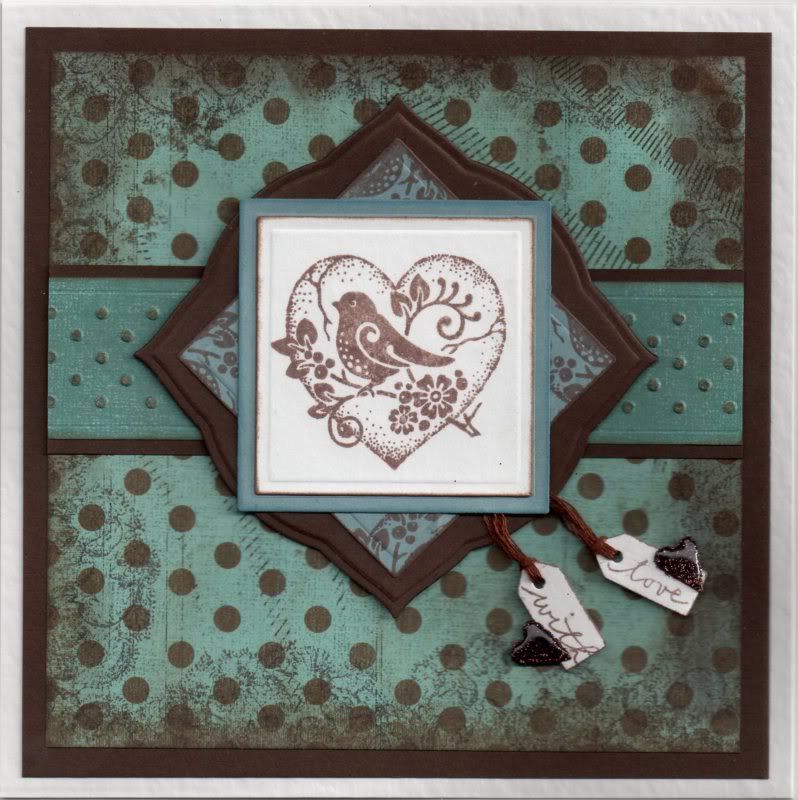
Duck Egg Blue and Brown Bird in Heart Valentine

Well, after a VERY late night, I finally got hubby's Valentine's card made. I decided to go with an unconventional colour scheme of duck-egg blue and brown.


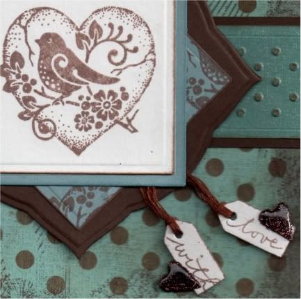
The image, a freebie from Craft Stamper Magazine designed by Graphicus, was stamped using Memento Rich Cocoa dye ink and then die cut using a square Nestabilities die. This was then matted onto blue paper.

A second square of the blue paper was stamped using part of the bird stamp using the Rich Cocoa ink and matted in the centre of a Labels 1 die cut.

Two mini tags were die cut using the Sizzix Sizzlits Hearts, Stars and Tags die and stamped using the 'With Love' stamp from the Woodware Jane's Script Sentiments stamp set with the Rich Cocoa ink. Two small hearts were die cut from the brown card and covered with brown glitter from the Lakeland glitter kit and covered with Anita's 3D Gloss. These were attached using brown embroidery thread between the two blue square layers.


A strip of the duck egg blue mottled paper, from the HOTP Vintage paper pad, was embossed using the dots border embossing folder from the Just My Type set of border folders from Cuttlebug. This was then matted onto a strip of the brown card.

A panel of the duck egg blue and brown polka dot paper, from the same paper pad, was stamped around the edge using the floral and scroll background stamp from the Aspects of Design Memories of Italy stamp plate from The Stampman using the Rich Cocoa ink. This was also colour tinted around the edges using the Rich Cocoa ink and the ColorBox Chestnut Roan fluid chalk ink.

The embossed strip was then matted across the square panel and onto the brown card.


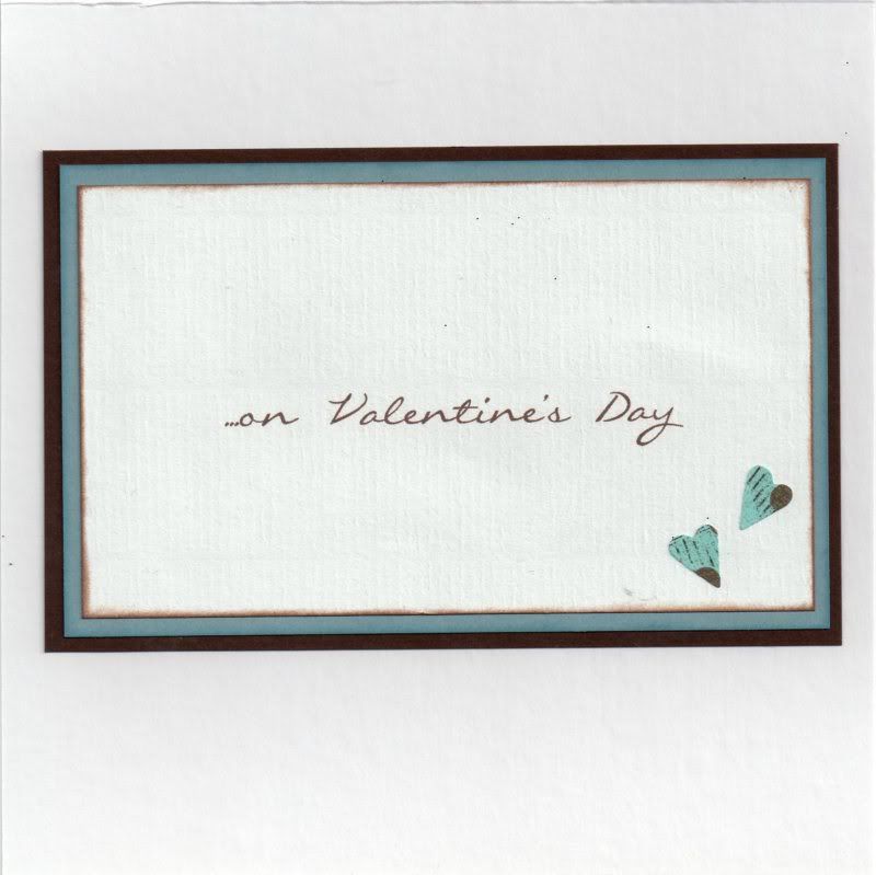
The inside of the card was also decorated using hearts punched from the polka dot paper. The sentiment was computer generated, using the Callie Hand font, which was the nearest one I could find to the Jane's Script font of the sentiment stamps.

Here are the challenges that I am entering this card into:

Friday, 26 November 2010

Blue and Brown Timepiece Tag

This is a something a little bit different from me - stamping, embossing and distressing. It's the first time I've used sequin waste as a stencil!!

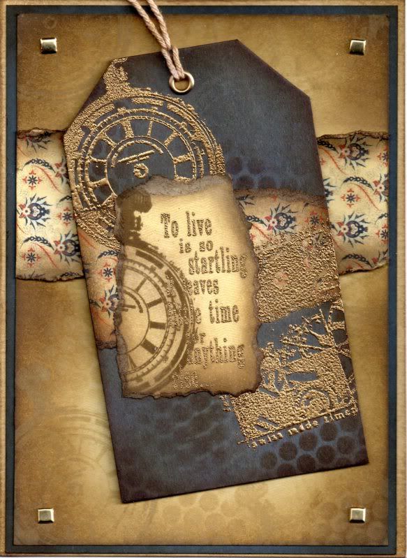
A blue luggage tag was distressed using a combination of Antique Linen, Frayed Burlap and Walnut Stain Tim Holtz distress inks. The Antique Linen and Walnut Stain inks were used to colour through a piece of sequin waste and then the tag was overstamped with the Pocket Watch stamp from the Paper Artsy Clocks 3 stamp set with the Antique Linen ink.


A strip of the Oxford paper from the Basic Grey Boxer paper pad was colour distressed with the three brown Tim Holtz inks and the edges curled. This was matted across the tag and overstamped with the Pocket Watch stamp and the Time Piece Collage stamp, also from the Clocks 3 stamp set, and gold embossed.

The 'To Live Is Startling...' sentiment, also from the Clocks 3 stamp set, was stamped onto the Commando paper from the same paper pad and gold embossed. This was then overstamped with the Pocket Watch image using the Walnut Stain ink. The image was then torn out and the edges distressed with the brown inks. A large gold eyelet was set in the top of the tag and threaded with string, which was coloured with the Walnut Stain ink.

A larger panel of the Commando paper was distressed with the Antique Linen and Walnut Stain inks and the Pocket Watch image was stamped over it with the Antique Linen ink. This was also used to colour through the sequin waste.

Another strip of the Oxford paper was distressed and matted across the stamped panel. This was matted onto blue card and gold square brads from Dovecraft were added in the corners.

Here are the blog challenges I'm entering with this card:

Friday, 19 November 2010

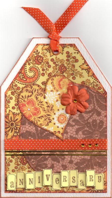
Yellow and Orange Anniversary Heart Tag

This card was based on a design in Creativity magazine (Issue 19) and uses the Papermania Sunshine Capsule Collection.

The card blank was cut into a tag shape. A circle of the orange lace paper from the Papermania Sunshine Capsule Collection paper pad was added over the edge of a tag shaped panel of the orange and yellow floral paisley paper and the excess trimmed away. A heart shape was cut from the yellow and orange medallion paper and attached over the two papers.

A length of the orange polka dot satin ribbon and some gold border peel-offs were added across the panel and three yellow faux gems were added to the ribbon.

A hole was punched at the top and an orange eyelet set and threaded with the orange ribbon. An orange paper flower was added over the edge of the heart and a yellow faux gem was added in the centre.

The letter panels were created by cutting rectangles from yellow linen card and stamped using the Studio G Hampton Art mini alphabet stamp set with the Versafine Vintage Sepia archival pigment ink and a line drawn around the edge with a fine liner. The letter panels were then added to the bottom of the tag, some flat and some 3D'd.

Tuesday, 19 October 2010

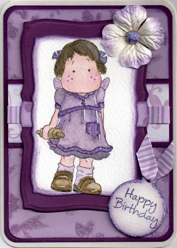
Lilac and Purple Tilda with Rolling Pin

Here is a card that I actually watercoloured - a novelty for me of late because I love using my Copics!!


The Tilda with Rolling Pin image, kindly donated by Alex K, was watercoloured using the Tim Holtz Distress inks.
  • Dress: Milled Lavender, Dusty Concord, Black Soot
  • Socks: Milled Lavender
  • Hair Ribbons: Dusty Concord
  • Hair/Shoes/Rolling Pin: Antique Linen, Frayed Burlap, Black Soot
  • Skin: Tattered Rose, Worn Lipstick
Highlights were added to the image using the Papermania Snow White gel pen.

The image was cut out using the Mega Curved Rectangles die from Nestabilities and colour tinted around the edges with the Milled Lavender and Dusty Concord inks. A larger panel was cut from the mauve card and a strip of the lilac blossom glitter paper from the Papermania Henbury Lane paper pack was adhered across it.

The Tilda image was then adhered to the shaped panel and a Prima paper flower was attached using a mauve Papermania brad to the top corner.

The corners of the card blank were punched with the XCut large corner rounder punch and the edges lightly colour tinted with the Dusty Concord ink.

Another panel of the lilac blossom glitter paper was cut and the corners rounded and matted onto a panel of the mauve card. A strip of the lilac and white flourish paper, also from the Henbury Lane paper pack, was matted onto a strip of the mauve card and a strip of the Anita's stripy lilac grosgrain ribbon was wrapped around the panel and the panel attached across the centre of the larger panel.

The sentiment tag was created by die cutting a Cuttlebug circle tag and the sentiment, from the Hero Arts Birthday Messages stamp set, was stamped in the centre of it with Versafine Imperial Purple archival pigment ink. The edges were then coloured tinted with the Milled Lavender and Dusty Concord inks and a short length of the lilac ribbon was threaded through the hole at the top.

The tag was then attached over the bottom corner of the Tilda image panel.

Highlights were then added to the image, flower, brad and sentiment tag using Craft Planet Lavender glitter glue.

Here are the blog challenges that I am entering this card into:

Monday, 12 April 2010

Blue and Black Sarah Kay Spring Blossoms Easel

This card was inspired by a card that Alex made during a friendly cardmaking get-together at Julie's last year. I've been wanting to have a go at this technique ever since and finally got around to doing it the other day. Hopefully you'll like the results.
You can see Alex's original card here.

I shall be entering these cards into the Cute Card Thursday blog challenge, #107, which has Mono Mania as it theme this week.

I started by stamping the Sarah Kay Spring Blossoms image from Stampavie onto 300gsm watercolour paper using Tim Holtz Faded Jeans Distress ink and the colour was then dragged out using a damp paintbrush. Extra colour was added to areas to add shadow.

The image was cut out using the Mega Rectangles Nestabilities die and the edges were coloured using the Faded Jeans ink and cut and dry foam, leaving the die in place to create a white border.

A larger mat was cut from dusky blue card and the edges colour tinted with ColorBox Charcoal Fluid Chalk ink and stamped with a flourish stamp from the Autumn Leaves Flourish V1 Rhona Farrer stamp set using the Versafine Smokey Grey archival pigment ink.


A panel of blue hessian effect paper from the Hot Off The Press Floral Ultimate Cardmaker's Creative Pack was matted onto a panel of the dusky blue card stamped with the Flourish stamp. A panel of the blue hessian effect flourish paper, from the same paper pad, was matted onto stamped blue card and a length of black sparkle weave ribbon was wrapped around this and matted onto the larger panel.

This was then attached to the easel card and the Sarah Kay image panel was attached onto this.

A circle tag was created from the blue card using the Cuttlebug circle tag and stamped with the Flourish stamp. A white circle to mat on top was cut from the watercolour paper using the Sizzix Sizzlets Circles #4 Frames die. The sentiment was stamped in the centre of the circle using the 'Make A Wish' stamp from the Dovecraft Studio G 'Make A Wish' mini stamp set using the Smokey Grey ink. This was then colour tinted using the Faded Jeans ink and a length of the black ribbon was threaded through the hole and the tag attached to the corner of the image panel.
A touch of sparkle was added to the ribbon and flowers in the image by adding Craft Planet Iridescent Sparkle glitter glue.
To create the stop part of the easel, the blue hessian effect flourish paper was matted onto a panel of the blue stamped card and a length of the black ribbon wrapped around. A sentiment panel was created using the Mega Curved Rectangles Nestabilities die, coloured using the Faded Jeans ink with the die still in place. the sentiment was stamped using the Happy Birthday stamp from the 'Make A Wish' mini stamp set and the Smokey Grey ink.

This was actually the second version of this card that I made. The original version, above, was created without the full front panel, but I decided it needed the panel to make the image stand out more.
Here is the card from the side, showing the construction of the card.

(Apologies for the quality of some of these pictures - they were taken on my camera phone - I really must find my proper camera and USB cable for it).

Sunday, 7 June 2009

Pink Leanne Ellis Girl with Bird Cage Gatefold

Finally I can upload this card! I've been wanting to upload this for a couple of weeks now, but restrained myself as I didn't want the recipient (Jules B) to get a glimpse of it before her birthday. But, I know she's received it now, so I can put it on my blog!


The card was made using one of my newest acquisitions - one of the lovely Leanne Ellis stamps called 'Fly Free' fron the Sugar Nellie family, available from Funky Kits.

I started by creating an off-centre gatefold 6" square card made from plum card. The flaps were covered with a combination of pink multi spots paper and purple mesh paper, both from the HOTP Citrus Cardmaker's Creative Pack. A strip of sky blue card from the DCWV Brights Card Stack was added across the right-hand flap.

A length of Anita's self-adhesive satin ribbon was added to hide the join of the two papers on the left-hand flap, and a length of narrow white lace was added down the edge of the left-hand flap.

The 'Fly Free' image was stamped using the Versafine Onyx Black archival pigment ink and watercoloured using the Whispers Brushstroke markers. The background colour, Whispers Rich Plum permanent dye ink, was added by sponging around the image.

A clear faux gem was added to the centre of the flower in her hair.

The sentiment 'Fabulous Friends', from the Smirk Love and Friendship stamp set, was stamped onto the image panel using the Onyx Black ink, and the panel was matted onto dark plum paper.

A tag was cut from the HOTP Citrus Cardmaker's Creative pack and a large silver eyelet set at the top. A piece of the lace was threaded through the eyelet, and a strip of the pink self-adhesive ribbon was attached across the tag, with a Prima paper flower attached to the edge of the tag with a small silver brad. The sentiment 'A Day To Celebrate', from the Hero Arts Birthday Messages stamp set, was stamped across the top of the tag using the Onyx Black ink.

The tag was backed with the dark plum paper so that it looked better when the card was opened. The image panel was attached at an angle to the left-hand flap, and the tag to the right-hand flap. Clear faux gems were adhered in rows of three to the top right and the bottom left corners.

A 'handmade by' panel was created for the reverse of the card using paper and card used on the front of the card, the Sizzlit Elegant Embellishments die, standard and scalloped circle Nesties and a strip of the narrow white lace used on the front.

Friday, 29 May 2009

DIY Marshmallow Fathers Day - Alex K's Blog Candy Challenge - CLOSED

Why is it when you really want to get down to some cardmaking there's always something getting in your way!

I wanted to get my entry for Alex's blog candy challenge out of the way about a fortnight ago, but what with one thing and another it didn't happen. Then, on Monday I said to myself I'd get it made on Tuesday, so of course I spent all day in bed with a migraine. I haven't had one for a long time, and this was a particularly nasty one. Not only that, but my eyesight seems to be getting worse just lately, so I'm going to have to dig my glasses out more often.


The blog candy up for grabs is amazing!!!!

Here is what the lucky recipient will receive from the very generous Alex:

- A set of Nestabilities - large plain Octagons
- A packet of designer Gromlets from We Are Memory Keepers
- 5 pink glittery cards with envelopes
- A pack of flower shapes
- A 2"x12" Papermania Oriental Spice Border pack
- 24 A4 sheets from the new Papermania Signature ranges Blueberry Hill and Regency (12 each)
- 20 6"x6" sheets of Core'dinations Whitewash cardstock
- 1 Autumn Leaves Butterfly stamp
- 4 reels of American Crafts Ribbon
- Bottle of Silver Metallic 3D paint
- A wallet with Hanglar images

Anyway, I finally managed to get the card made yesterday. The sketch that Alex produced for the challenge looked particularly 'girlie' with the flowers on it, but I decided to adapt it to a masculine card, mainly because I had to make my Father's Day cards earlier than normal as my father-in-law is going on holiday at the start of June so I've got to get it to him before he leaves.


Anyway, I hope you don't think I've taken too many liberties with the sketch!!!

I started by stamping the Marshmallow DIY image from the Marshmallow Does DIY stamp set from Daisy and Dandelion using the Versafine Onyx Black archival pigment ink and watercoloured it using the ColorBox Amber Clay and Chestnut Roan fluid chalk inks.


The 'Warning' tag image was also stamped using the Onyx Black ink and watercoloured with the Amber Clay ink and a small length of Anita's tan leather sticky ribbon was threaded through the tag. The toolbox image was also stamped and coloured as for the other images.


The edges of the Marshmallow image panel, as well as all the other panels, were coloured using the Amber Clay and Chestnut Roan fluid chalk inks, and matted onto beige textured cardstock.


Two matching papers from the Daisy and Dandelion Picnic Patch paper pad were matted onto another piece of the beige card and a length of the tan leather sticky ribbon was adhered onto a strip of the beige card and then attached across the join of the patterned papers.


The Circle Journalling image from the Studio G Mini Journalling Blocks stamp set was stamped onto white card using the Onyx Black ink and the 'Best Wishes' sentiment from the Papermania Clare Curd Sentiments set was stamped within it. This was then watercoloured using the Amber Clay ink. Silver embroidery thread was tied through a hole made through the top of the circle and threaded under the leather ribbon and through to the back of the panel. A mini silver brad was pushed through the hole in the panel to make it look like the brad was holding the sentiment in place.


The 'Warning' tag and toolbox images were then adhered over the edges of the Marshmallow image panel.

I decorated the inside of the card with a strip of the striped paper as used on the front of the card and stamped the sentiment using a 'Happy Father's Day' stamp from Inca.


I also made a 'Handmade By' medallion for the reverse of the card.
Watercolouring with the fluid chalk inks is a bit of trial and error. You need to add quite a lot of water so you don't get too thick a colour as they can obliterate the stamped lines, as you can see below on the second Father's Day card I made.


This was made almost the same as the challenge card, but on this one I added the 'Warning' tag to the Marshmallow image panel and added the word 'DAD' down the right-hand side.

This was done by stamping the letters from the Papermania Fun Letters stamp set onto both the striped paper and the beige texture cardstock.

The patterned letters were stamped using the Onyx Black ink and cut out close to the outline and the cardstock letters were stamped using both the Amber Clay and Chestnut Roan chalk inks and layered up.

The screwhead image from the Marshmallow Does DIY stamp set was then stamped onto the letters and traced over with an orange Sakura metallic gel pen.
Blog Widget by LinkWithin