


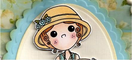
The digi image, Cherry Kisses Tea in the 20s, from Pollycraft, was printed out and coloured with Copic Sketch markers:
- Hat: E41, Y21, BG11
- Flowers: BG11, B00
- Leaves: YG95, G07
- Hair: E33, E35, E37
- Skin: E00, E21, E51, R02, R20
- Dress: Y21, BG10, BG11, B00
- Shoes: BG10, BG11, B00
- Cup: Y21, E41, BG11, B00
The image was then cut out.

A scalloped petite oval was die cut, using a Nestabilities die, from light blue cardstock and distressed around the edges using Tim Holtz Antique Linen distress ink and a plain petite oval, also distressed, was matted on top. The image was then centrally matted using 3D foam pads.
A strip of the light blue and cream scroll paper from the Prima Botanical paper pad was matted onto a strip of the light blue card that has been punched with the XCut Lace Trim border punch and a length of cream crochet lace was wrapped around it.
This was then matted onto a panel of the light blue and cream roses paper from the same paper pad and matted onto the light blue cardstock. All panels were distressed with the Antique Linen ink.
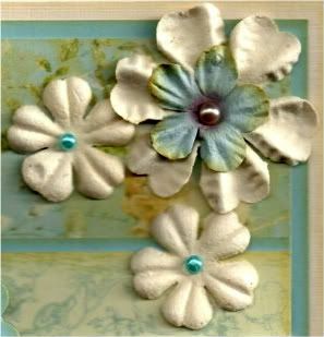
Three cream Prima paper flowers from the Botanical Mix were added in the top right corner. A light blue Prima flower was added in the centre of the large flower and turquoise self-adhesive pearls from the Hobby House Sea Green set were added in the centres of the smaller flowers and a champagne pearl from the Kort & Godt Autumn set of pearls was added in the centre of the larger flower.
The sentiment, from the Papermania Clare Curd Sentiments stamp set, was stamped onto the cream card using Memento Rich Cocoa dye ink and matted onto the light blue cardstock and added in the bottom right corner of the card.

Here are the blog challenges I am entering this card into:
- Copic Creations - #56 - Blue-Greens
- Cupcake Craftroom - Soft and Sweet
- The Emerald Fairie Garden - #7 - Birthdays
- Happileigh Scrappin' - #35 - Cool Colours
- Incy Wincy - #106 - 3 embellishments, 2 papers, 1 image
- Make It Monday - #50 - Anything Goes
- Paper Playtime - #53 - Anything Goes
- Victorine Originals - #14 - Birthdays
- The Ribbon Reel - #8 - Citrus Sunshine
- Crafty Pad - #134 - Cute 'n' Girly
- One Stitch At A Time - #75 - Anything Goes
- Craft Your Days Away - #26 - Birthday Celebrations
- Card Makin' Mamas - #26 - Birthday Cards
- Crafty Ann's - #47 - Scallops and/or Fancy Borders
- Fussy and Fancy - 3+ Favourite Embellis
- Fussy and Fancy - Celebrations (1000 Follower Challenge)
- Inspire Me Fridays - #19 - Anything Goes
- Jellypark - Use Your Favourite Embellishment
- Sweet 'n' Sassy Digi Challenge - #15 - Let's Use Lace
- Craft Us Crazy - #14 - Anything Goes
- Some Odd Girl - Use Complementary Colours
- A Spoonfull Of Sugar - #162 - Birthdays
- Anything Goes - #47 - Happy Birthday/Celebration
- Deep Ocean - #6 - Light Blue
- Papertake Weekly - Bingo (Lace, Blooms, Free or Pearls, Blooms, Free)
- Try It On Tuesday - Anything Goes
- Crafts and Me - #48 - Blues or Blue/Green
- Divas By Design - #8 - Birthdays
- Papercraft Star - #58 - Photo Inspiration
- Scrapbook Sisters - #48 - Blue
- Simon Says - Food and Drink
- Stampavie and More - #149 - Girlie
- Truly Scrumptious - #63 - Lace It Up
- Addicted To Stamps - #10 - Anything Goes
- Pollycraft - #106 - Distressing





 Posts
Posts


