


So, I then had to decide on a patterned paper, and having decided I wanted to add vellum behind the window, the paper sort of chose itself as I have the Papermania Exquisite Vellum pack and the matching Exquisite paper pad.
As the papers have cream as a base colour I decided to make the window gold. I had originally decided on silver, but all that changed once the papers were chosen.
So, having cut out the window shape from gold satin cardstock, I roughly cut a piece of the script vellum to fit behind.
I then cut a strip of the scroll leaf paper and matted it onto the gold satin card.
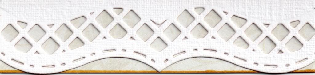
The next part was the fun part.......the Spellbinders Bracket Borders 1 dies. These are my most favourite of dies at the moment, at least until I buy some new ones, I'm very fickle like that!
I opted for the lattice inset die as that one seemed the most masculine of the three and the dot dash edge die to go with it. Both were placed against the edge of the card blank and die cut. Not as easy as you might think in a Bigshot as these would benefit from being run through the machine lengthwise but I didn't have that luxury so I placed them on my baseplate at a slight angle and ran them through as far as they would go without damaging the edge of the card blank. I then turned the whole thing around and ran it through again. Because the rollers have a tendency to jump over the dies when they are parallel to the die, it took a few passes to get it completely cut out, but the effect it gave was well worth it.
The sentiment, from the Woodware Jane's Script sentiment stamp set, was then stamped onto the patterned paper strip using Memento Espresso Truffle dye ink. The same ink was also used to stamp the cross, a Katie & Co image, directly onto the cardblank. The image was positioned using a Stamp-a-ma-jig to ensure it was in the centre of the window once it was added over the top.
All the pieces were edged using the Y26 Copic marker to match in with the gold card stock.

For the inside, I die cut another window shape and matted my writing paper behind it that I use for the insert panels in my cards. A panel of the scroll leaf paper was die cut using the dot dash edge bracket die, as was a panel of the gold satin card. These were layered together and added to the bottom edge of the card, so that the pattern on the paper shows through the lattice design on the front.

Here are the challenges I'd like to enter this card into:
- Through The Craftroom Door - Anything Goes
- Crafty Boots Challenges - Celebrations
- Love To Scrap - #5 - Anything Goes
- Make It Monday - #140 - Anything Goes
- Great Impressions - Celebrations
- Scrappy Frogs - Free Challenge
- That Craft Place - Makes For Men
- Hiding In My Craft Room - HIMCR #97 - Super Scraps Saturday
- My Time To Craft - #221 - Decorate The Inside To Match The Front
- Our Creative Corner - Anything Goes
- Paper Creator's Craft - #8 - For The Boys
- Crafty Catz - #182 - Anything Goes
- Inspire Me Fridays - #102 - Anything Goes
- Simply Create Too - #37 - Anything Goes
- Sister Act Card Challenge - #6 - Anything Goes
- Totally Papercrafts - #166 - CAS
- CCEE Stampers - CCEE1319 - CAS Card with Scraps
- Moving Along With The Times - CAS
- Paper Crafting Journey - Anything Goes



 The inside of the card was also decorated with strips of the colour-tinted green paper and the DCWV cherry paper. The flourish image was 'second-impression' stamped using the Port Wine ink, and the sentiment was stamped over the top using the same ink.



 Posts
Posts


