Pages

WELCOME

This blog was created to act as a record of the cards and other projects that I have made. It is for both my own reference and to help inspire anyone who wants to take a look.

I'd love it if you'd leave me a comment so that I know what you think of my projects and that you've been to visit!

Anyone can comment, even those who don't have a blog. (Just look for the word 'Comments' under the three little pictures at the end of each post). Readers without a blog can add an anonymous comment, but please leave your name (and docrafts username if applicable) so I know who you are!

Slideshows of all the cards I've uploaded to my blog can be found at the bottom of the page.


PEOPLE WHO FOLLOW MY BLOG

Showing posts with label fibres. Show all posts

Friday, 13 November 2015

Green and Grey Chester Pocket Card

This is a different type of card for me. It is based on a project that I found on the Splitcoaststampers tutorials page here, a Pocket Card.

With this design of card, the card doesn't actually open, but the sentiment and handwritten greeting go onto a tag that is placed within the pocket section of the card.
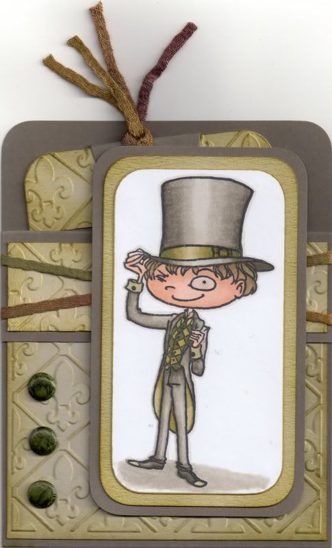
 
 
To begin with, the image, Chester by Kraftin' Kimmie, was stamped using Memento Tuxedo Black dye ink and coloured using Copic markers.
 
Copics:
Skin: E00, E11, E21
Hair: E41, E43, E44
Hat/Jacket/Trousers: W1, W3, W5, W7
Hat Band: YG91, YG95, YG99
Tie: G99
Waistcoat: YG95, G99
Inside Jacket: YG91, YG95
Shirt: YG91
Shoes: W5, W7, YG91
Shadow: W1, W3
Outline: W1
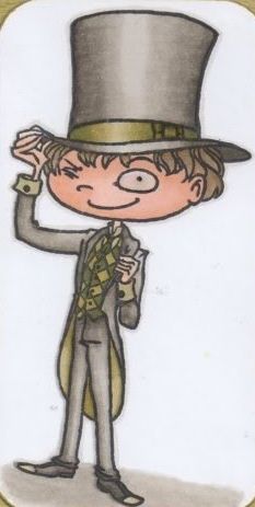
 
 
The image panel was then matted onto green and then grey cardstock.
 
The next step was to create the Pocket Card.
 
A piece of card measuring 4" x 11" was then scored in half and then scored again 1.25" from one edge. A panel of white card was embossed using the Cuttlebug Fleur de Lis embossing folder and distressed with Tim Holtz Crushed Olive and Forest Moss distress inks. This panel was adhered to the large front panel of the card. A smaller strip of white card was also embossed and inked with the Crushed Olive and Forest Moss inks and this panel was then adhered to the front flap panel.
 
A couple of lengths of green fibres from the HOTP Sarabooks Emerald Fibres set were then wrapped around the front flap and the flap then adhered down to the front panel.
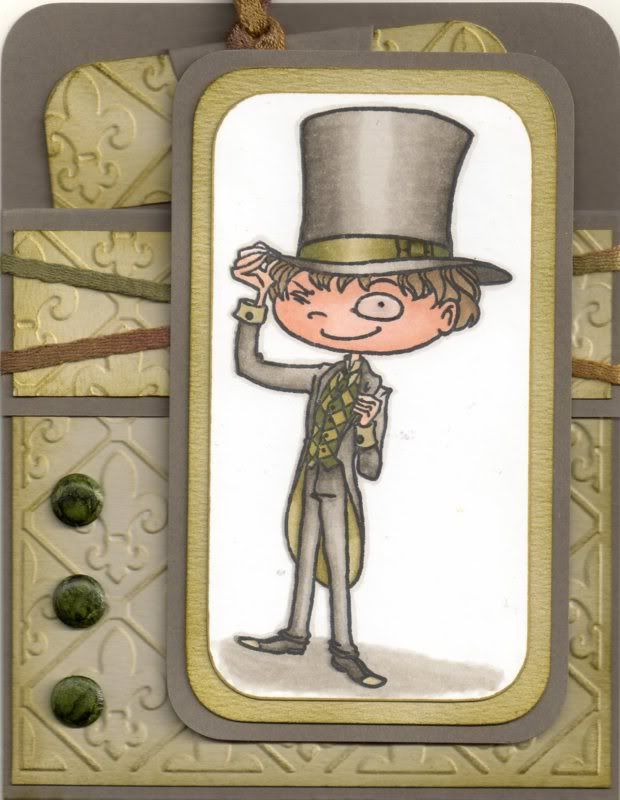
 
 
Three green card candi were then coloured using the G99 Copic marker and added to the front panel, as was the image panel. Glossy accents were added to the monocle in the image.
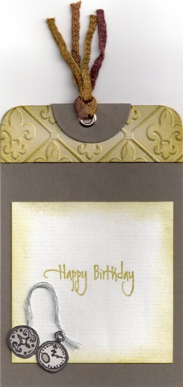
 
 
To complete the card, a tag was created. A strip of the embossed and coloured white card was added across the top of the tag, as was a circle of grey cardstock, diecut using a Nestabilities circle die, and then folded in half.
 
A silver eyelet was set in the top of the tag and more of the green fibres were threaded through it.
 
The pocket watch image was stamped using the Tuxedo Black ink and coloured with the W1, W3 and W5 Copic markers. A length of silver embroidery thread was threaded through the image and added to the tag. The sentiment, from the Elzybells Swirly Sentiments stamp set was stamped onto the tag using Versafine Spanish Moss archival pigment ink.
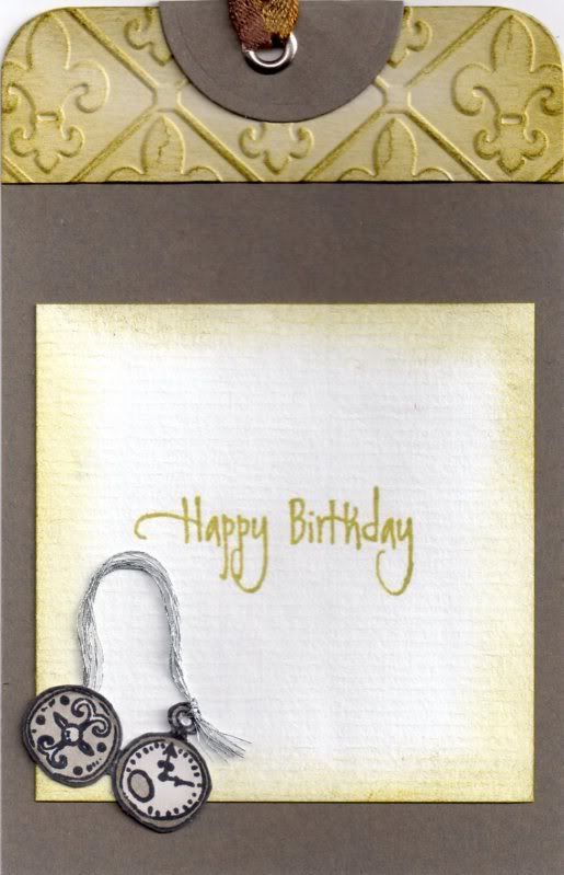
 
 
The tag was then slotted into the pocket on the front of the card.

Monday, 27 June 2011

Blue and Grey Paper Artsy Castle

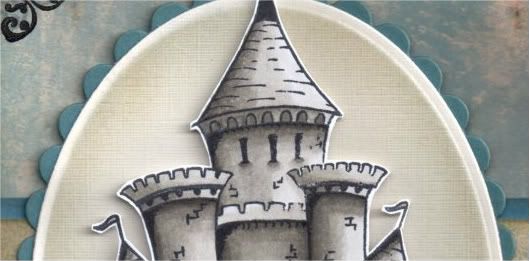
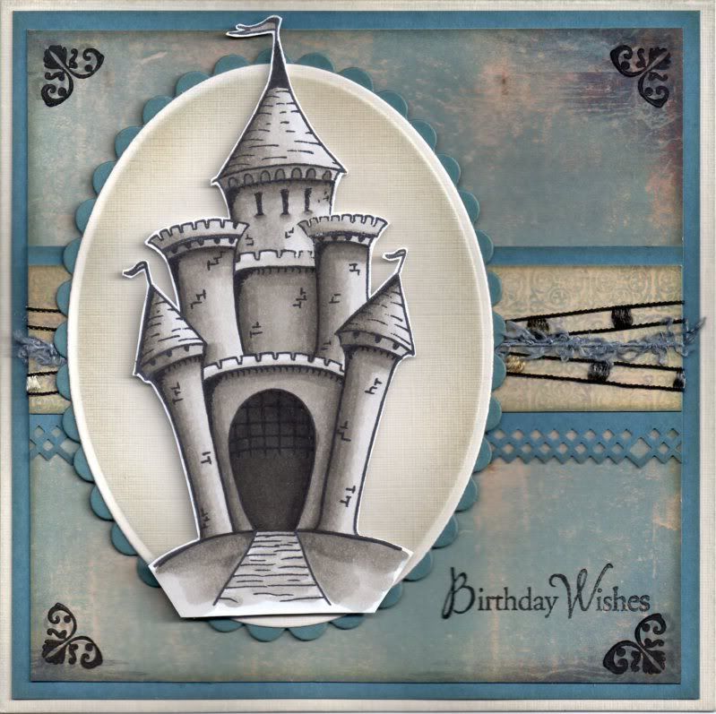
So, as promised, here is the card I made using the Castle stamp from the Paper Artsy Crowns and Castles 4 stamp set.


The Castle image was stamped using Memento Tuxedo Black dye ink and coloured with Copic markers:
  • Castle: W1, W3,W5,W7,W9
The image was then cut out.

Using Nestabilities dies, a petite cream oval and petite scalloped blue oval were die cut. Keeping the cream die cut within the die, the edges were distressed using Tim Holtz Weathered Wood and Antique Linen distress inks with shaving brushes. I much prefer the effect using the brushes to the Cut & Dry foam as I always get heavy smudges when I use the foam, whereas this gives a much softer look.

The Castle image was then mounted in the centre of the ovals.

A panel of the cream and blue medallion paper from the DCWV Once Upon A Time mat stack was then matted onto a strip of the blue card punched with the XCut Diamonds border punch and lengths of brown ladder ribbon and blue fibre from the HOTP Sapphire Sarabooks fibres were wrapped around it.


This was then matted across the blue distressed birds paper from the same mat stack. The edges of all of these pieces were distressed with the two distress inks and then matted onto blue card.

The corners of the blue distressed paper were then stamped using a small corner flourish stamp from the Fiskars Friends Forever Quotes stamp set and Versafine Smokey Gray archival pigment ink and then overstamped with Brilliance Graphite Black pigment ink.

The Birthday Wishes sentiment, from the Hero Arts Birthday Messages stamp set, was stamped in the bottom right corner also using the Graphite Black ink.

Here are the challenges I am entering this card into:

Tuesday, 21 June 2011

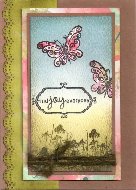
Pink Green and Blue Paper Pieced Butterflies

Well, as promised here is my attempt at colouring with Distress Inks and the shaving brushes from Wilkinsons in place of the much more expensive Inkdusters or similar. The card I made, an anniversary card, was actually based on a beautiful tag created by the very talented ClarkyJ and you can see her stunning masterpiece here.

Having looked back at Janet's tag, I realized hers looks more balanced as she has followed the 'rule of thirds' whereas mine is more half and half. I shall try and remember that for the future!!


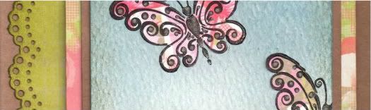
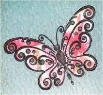
I started by stamping the Butterfly image, from Chocolate Baroque/Craft Stamper, onto pieces of the pink butterfly paper from the Papermania Summer Bloom paper pad using Brilliance Graphite Black pigment ink and cutting them out.

A piece of white textured card was coloured using the shaving brushes and a selection of Tim Holtz Distress inks. The green area was created using Shabby Shutters and Forest Moss and the blue area using Weathered Wood and Faded Jeans. The edges were then distressed with the Walnut Stain ink. In retrospect, I think maybe Antique Linen may have been a better idea - never mind!

The green area was then overstamped using the Forest Moss ink and the Cone Flower and Grass stamp from the Inkadinkado Meadow stamp set.


The butterfly image was stamped a couple of times onto the blue area and then paper pieced using the pieces already cut out. The excess was cut away from the edge of the panel.


The sentiment, from the Hero Arts Anytime Messages stamp set, was then stamped onto the panel using the Graphite Black ink and then a frame from the Papermania Mix and Match Frames stamp set was stamped to go around it. The frame section was coloured in using a black Whispers Brushstroke marker.

A clear Sakura Stardust pen was then used to trace over the frame and the word 'JOY' and on the swirly sections of the butterflies. You can just make it out on the above pictures.

A length of green fibres from the HOTP Emerald Sarabooks Fibre Pack was then tied around the panel and this was then matted onto a panel of the pink dragonfly paper from the Summer Bloom paper pad.


A strip of the lime green plaid paper from the same paper pad was punched using the Martha Stewart Doilly Lace border punch and distressed with the Forest Moss ink. This was matted directly onto the card blank and the image panel matted over the top to the right of the card blank.

Here are the challenges I am entering this card into:

Sunday, 7 March 2010

Masculine Italian Architecture

I really like the Travels in Italy stamp set from Crafty Individuals, so have made a couple more cards using it in a couple of different colourways.


The first card I made in a green and brown colourway. The image was stamped onto the green paintstroke paper from the K&Co Basic Grey Sublime paper pad and cut into squares. Three of the squares were then matted onto cream and brown card.


The sentiment was stamped onto a square of cream card using the 'Warm Wishes' stamp from the HOTP Sentiments stamp set and Versafine Vintage Sepia archival pigment ink. The panel was then colour distressed using ColorBox Chestnut Roan fluid chalk ink.


A panel of the brown map paper from the K&Co Life's Journey Map paper pad was matted onto a square of the brown card and lengths of brown ladder ribbon were wrapped around it.


The square image and sentiment panels were then adhered centrally to the card.


The second version was made in exactly the same way but using blue and mustard yellow.


The images were stamped using Versafine Onyx Black archival pigment ink on the brown paintstroke paper from the K&Co Basic Grey Motifica paper pad. The sentiment was also stamped using the Onyx Black ink.


A panel of the blue flourish paper, also from the Motifica paper pad, was matted onto mustard yellow card.


The inside of the card was decorated using a strip of the blue flourish paper and the 'Happy Birthday' stamp from the Papermania 'Just For You' stamp set, stamped using Versafine Majestic Blue archival pigment ink.


Wednesday, 13 January 2010

Blue and Brown Landmarks and Tickets

I really like the "London, New York, Paris, Rome" Landmarks stamp from Crafty Individuals, so here's another card made using it. This time I used the Basic Grey Granola paper pad.

Firstly, the edges of the Crunchy paper from the Basic Grey Granola paper pad were distressed using ColorBox Chestnut Roan fluid chalk ink and matted onto dark brown cardstock.
Then the Landmarks image was stamped onto the Flax paper from the same paper pad using Versafine Vintage Sepia archival pigment ink and matted onto beige and dark brown cardstock. A length of brown ladder ribbon was then wrapped around the Crunchy paper panel.
The Travel Tickets image, also from Crafty Individuals, was then stamped onto cream card using the Sepia ink, and three of the ticket images were cut out and colour distressed using Tim Holtz Faded Jeans and Scattered Straw distress inks and Ink It Up! Chocolate Brown dye ink.
Using the Sizzix Sizzlet file folder die, a beige file folder was die-cut and the edges ink distressed. The word 'Tickets' was hand-written on the tab using a black fineliner pen, and the word 'Celebrate' was stamped on the front using the 'Celebrate with Style' stamp from the Hero Arts Birthday Messages stamp set and the Sepia ink. The ticket images were adhered to the inside of the file folder.
This Landmarks stamp is a great stamp for masculine cards, and I foresee it being used quite a lot in 2010.

Tuesday, 8 September 2009

Brown and Blue Two Today Dandelion

I decided to enter the Pollycraft Blog Challenge #23 this week, and the theme this week is 'Furry Friends'. I decided to use one of the lovely Dandelion stamps from the Daisy and Dandelion stamp set.

The card is for a little two-year-old boy, the son of a friend of mine.

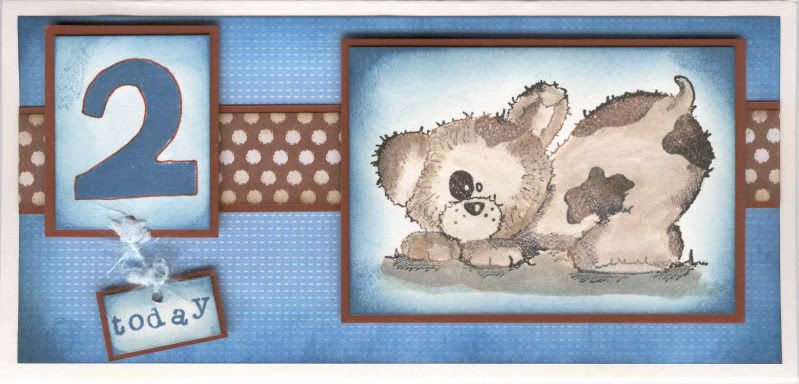
I started by stamping the Dandelion image onto cream cardstock using Versafine Onyx Black and Vintage Sepia archival pigment inks, giving the image a mottled effect. The image was then watercoloured using Tim Holtz Frayed Burlap distress ink.

The edges of the image panel were then distressed using the Tim Holtz Faded Jeans distress ink, and matted onto brown cardstock.

The number '2' was stamped using the Faded Jeans ink and a foam stamp from the Papermania Large Sheet Numbers stamp set. The number was outlined using the fine end of a brown Whispers Brushstroke marker.

The word 'today' was also stamped onto cream card using the Faded Jeans ink and a Studio G mini alphabet stamp set. The two panels were then distressed around the edges using the Faded Jeans ink. Both were then matted onto brown cardstock and a length of pale blue fibre was tied between both of the panels to suggest movement.

The card blank was covered using the blue mesh paper from the Daisy and Dandelion Picnic Patch paper pad, first distressed with the Faded Jeans ink. A strip of the brown polka dot paper, also from the Picnic Patch paper pad, was distressed with the Frayed Burlap ink and then matted onto the brown cardstock, was attached across the blue paper and the image panels adhered on top using 3D foam pads.

Thursday, 19 March 2009

Pink and Brown Floral Mother's Day Tagbook

Well, I finally got the second Mother's Day tagbook finished. I was starting to think I was going to have to swap them round as the first one I made was intended for my MIL and doesn't need to be posted as she will be with us on Sunday, whereas my mum's did have to be posted!! However, after yet another late night, I managed to get it finished in time for today's post!


Three tags were cut from dark brown cardstock, and a spine was scored down the left hand side. Three holes were punched through the three tags using the Big Bite. As preparattion for the tagbook, a piece of the pink 'Happy Mother's Day' text paper from the Papermania Flowery Colossal paper pad had computer-generated 'Happy Mother's Day' text printed on it in brown.


The first tag was covered with the multi-coloured floral paper from the Papermania Flowery Colossal paper pad.

A flower was cut from the yellow outline flower paper from the same pad and coloured using the Whispers Brushstroke markers, and highlighted with white gel pen. Pink faux gems were added to the flower, and then attached to a panel of the pink 'Happy Mother's Day' text paper, which in turn was matted onto the dark brown card.

A strip was cut from the printed section of the pink 'Happy Mother's Day' text paper and matted onto a strip of the brown card. This was then adhered along the edge of the tag.


I then made a start on the inside pages.


For page two, the tag was covered with the multi-coloured stripe paper from the Flowery Colossal paper pad. A strip was cut from the computer-generated text paper and matted onto the brown card.

A flower was cut from the yellow outline flower paper from the pad and coloured using the Whispers Brushstroke markers, and again highlighted with white gel pen. Pink faux gems were added to the centre of the flower.


For page three, the tag was covered with the brown floral paper and a strip of the multi-coloured stripe paper from the pad was matted onto a strip of the salmon pink card.

The letters were cut from the salmon pink and brown card using the Sizzix Sizzlets Bounce Alphabet die set.

A white/pink Prima paper flower was coloured on the edges using a salmon pink Whispers Brushstroke marker and a white bead was attached in the centre.


For page four, I chose a definition from the HOTP Definitions and Words Ephemera book.


This was matted onto a panel of the multi-coloured stripe paper. The tag was covered with the pink 'Happy Mother's Day' text paper, and the definition panel matted on top.

A flower was cut from the yellow outline flower paper and coloured using the Whispers Brushstroke markers and highlighted with white gel pen. Pink faux gems were added to the centre of the flower.


For page five, the tag was again covered with the brown floral paper, and a strip from the computer-generated text was matted onto the salmon pink card.

Another white/pink Prima paper flower was coloured with the salmon pink pen and pink faux gems were added to its centre and the lower corner of the tag.


For the back page, the tag was covered with the multi-coloured floral paper A smaller tag was made from the salmon pink card and brown satin ribbon was threaded through the holes. A computer-generated sentiment was adhered on the top.

The corners of the tags were rounded using the XCut Large corner rounder punch and then tied together using Anita's Copper Brown striped grosgrain ribbon and cream fibre.

Hopefully my mum will like the tagbook. I certainly enjoyed making it, despite the time pressures. I really wish I could be more organized when it comes to getting cards made in advance. Hopefully once I get my craft room back to normal (I have to pack it all up again on Friday for the in-laws' visit) I'll spend more time in there and get more cards made. I've got two to make before I pack up, and hopefully I'll get them done tomorrow!!

Monday, 16 March 2009

Blue Butterfly Mother's Day Tag Book

Here is the first of the two tag books I've decided to make for Mother's Day this year. I wanted to make something special this year as I didn't manage to make any Mother's Day cards last year due to the house move and all my stash still being boxed up.

I started by making the three tags from blue card. The tags were scored to create a spine to make opening the tag book easier. Each side of the tags was covered with patterned paper from the Papermania Flowery Colossal paper pad.

The front page was covered with the butterfly paper and was decorated using a butterfly cut from the remainder of the sheet and silver wire antennae were added. This was matted onto a piece of the blue/green spots paper from the same paper pad. The sentiment was cut from the 'Happy Mother's Day' text paper and matted onto the blue cardstock.


Page two was covered with the blue/green spots paper and a strip of the 'Happy Mother's Day' text paper. This was also decorated with a butterfly with wire antennae.


Page three was covered with the 'Happy Mother's Day' text paper (a section without the text) with a strip of the blue/green spots paper over the top. The 'MUM' letters were cut using the Ellison Curlie Girlie thin cuts alphabet set and embossed using the Ellison Spots embossing folder. The letters were coloured using the ColorBox Prussian Blue Fluid Chalk ink.


The tag was finished with a blue Prima flower embellished with a pearl bead.


Page four was covered with the blue/green abstract paper from the Papermania Flowery colossal paper pad, with a smaller panel of the blue/green spots paper over the top. A butterfly was cut from the butterfly paper and wire antennae were added. A definition from the HOTP Definitions and Words Ephemera was added and embellished with a light blue faux gem.


Page five was also covered with the blue/green abstract paper and a strip of the 'Happy Mother's Day' text paper was attached over the top. A blue Prima flower, embellished with a light blue faux gem was adhered to the bottom of the tag along with a row of larger light blue faux gems.


The back page was covered with the butterfly paper and a tag made from green card was added with pale blue organza ribbon threaded through the holes.


Holes were punched through all the tags along the spine section and were tied together with narrow light blue satin ribbon and blue/green fibre. The corners of each page were punched with a corner rounder and the edges of each of the tags inked with the ColorBox Prussian Blue Fluid Chalk ink.

I shall be entering this into Clare Curd's Card Challenge this week which is to create a card for Mother's Day. Follow the link for more details on how to enter.

Tuesday, 3 March 2009

Peacock Blue Traveller Edwin

I finally got my table back up yesterday and managed to make a birthday card for my 'little' brother (he's 25 this year!!!). I think I might have to get more of my stash out and down than I'd hoped as it's completely unworkable as it is. I'm having to move everything slightly just so I can get something out. It's a complete nightmare!!!


Anyway, here is my creation. I love these colours at the moment, and I'm really pleased with my watercolouring on the Edwin image, even if I do say so myself!!!

The Edwin image, 'Traveller Edwin', was kindly donated by Alex K (Eisbaerin).

Edwin was watercoloured using the Whispers Brushstroke markers and highlighted with white gel pen. The wings were then highlighted with Craft Planet Iridescent Sparkle glitter glue.

A curvy frame was cut from peacock blue cardstock from the DCWV Brights mat stack, and matted over a piece of green cardstock embossed using the Cuttlebug 'Spots and Dots' folder (kindly donated by Tara W (Kania)). The Edwin image was cut out and 3D'd onto the frame.

A wavy mat was cut from a patterned paper from the HOTP Ultimate Creative Pack and a strip of matching paper was adhered across it. This was then matted onto the peacock blue card from the DCWV Brights mat stack.

Two tickets from the Autumn Leaves Tickets stamp set were stamped using ColorBox Prussian Blue Fluid Chalk ink onto the matching piece of paper from the HOTP paper and cut out. These were edged with ColorBox Prussian Blue Fluid Chalk ink and highlighted with white gel pen, then attached to the mat beneath the frame.

A letter 'D' from the Colorbok Letters set was coloured using ColorBox Celadon Pigment ink and edged with ColorBox Prussian Blue Fluid Chalk ink. Highlights are added using white gel pen. A teal blue button was threaded with a matching fibre from the HOTP Sarabooks Sapphire fibre pack and both were attached to the bottom right hand side of the card.

Thursday, 6 November 2008

DH's Anniversary Card For Our 10th Anniversary

I am taking a huge risk posting this on here. DH (Phil) hasn't had a look on here since I started this blog. He occasionally asks me what it is that I post on here, and stares at me with that look of incredulity (you all know the one) when I get excited that someone has left a comment, or I hit another 100 views on my blog counter.

So, with that in mind, I'm daring to post the anniversary card that I've made for our 10th Wedding Anniversary that we will be celebrating in December. I'm trying to get ahead with my 'normal' cards so that I can make a start on my Christmas cards and not have to worry that I haven't got my cards made for January after the holidays.

Anyway, apart from the imminent 'New Baby' card that is due to be made for the end of November, I am now up to date with my 'normal' cards, with them all made up to the end of January. Tomorrow, the big tidy up can commence in my craft room and I can get my Christmas stash out!!

So, this was the last card to be made, and hopefully it will go down well!

The card blank is deep red hammer card, and was folded to make a zigzag card. The patterned papers are from the Hot Off The Press (HOTP) Classic Creative Cardmakers Pack. The chosen papers were cut to shape and the edges inked with a black inkpad.

For the back page, I took the rectangle of patterned paper, and cut out a frame from the lower half. A piece of white paper was attached behind the frame, giving an area on which to stamp the greeting. The positioning of the frame ensures that it cannot be seen when the card is closed. A photo corner was cut from matching deep red hammer card using the Ellison Photo Corners Thin Cut die.


The other patterned paper panels were attached to the card blank, and punched border strips were then added along the cut edges. These are actually the waste from the lace borders that I added to the pink/black anniversary cards I made the other week using the Fiskars Lace Border punch, and thought these would come in handy for another project - and I was right. These are a lot less fussy and feminine than the lace part, and I think they work with the design.

The tag is artwork included in the HOTP Classic Creative Pack, which was simply cut out, and a black eyelet added (using my now very trusty Big Bite!) and some beige ribbon threaded through. A HOTP Word Fragment was 3D'd to the tag, and this was then adhered to the second panel of the card.

On the front panel, I used my HOTP Labels template to create the name plaque, using matching papers from the HOTP Classic Creative Pack. The letters are from the ColorBok Alphabet set. They are white paper letter die cuts that were coloured using the Brilliance Rocket Red pigment ink and over stamped using the Brilliance Graphite Black pigment ink and the Stone Texture stamp from the Judikins Artifacts cube.

Four lengths of brown ladder ribbon were attached to the front panel and the name plaque, complete with monograms (our initials) was added over the top of the ends of the ribbon.


I am entering this card into the Double Dutch Blog Challenge, the current challenge being to use only three techniques from the list on their blog.

The three techniques I have used are:
STAMPING
PUNCHING
EMBELLISHMENT MAKING

Head over there to see what the design team have come up with, and enter your creation.
Blog Widget by LinkWithin