Pages

WELCOME

This blog was created to act as a record of the cards and other projects that I have made. It is for both my own reference and to help inspire anyone who wants to take a look.

I'd love it if you'd leave me a comment so that I know what you think of my projects and that you've been to visit!

Anyone can comment, even those who don't have a blog. (Just look for the word 'Comments' under the three little pictures at the end of each post). Readers without a blog can add an anonymous comment, but please leave your name (and docrafts username if applicable) so I know who you are!

Slideshows of all the cards I've uploaded to my blog can be found at the bottom of the page.


PEOPLE WHO FOLLOW MY BLOG

Showing posts with label Prima. Show all posts

Tuesday, 19 January 2016

Red, Teal and Green Katy Sue Hat and Stand

My apologies for the lateness of this post but I have been having issues with Internet Explorer all day. I can't upload pictures of my cards using Microsoft Edge and today IE has just not wanted to play ball. Anyway, it seems to be working at the moment, so I'll get on with uploading this as quickly as possible.

This is a card that I made, finally using the beautiful set of stamps by Katy Sue Designs that I bought at the Newbury Artstamps Show. Yet another of those 'must have' purchases that have been sitting in my stash unused.

I decided to use the Prima Madeline paper pad as I really love the colours and they matched the guide illustration on the packaging.
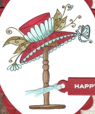
 
The hat and stand image, from the Katy Sue Designs Gerbera stamp set, was stamped using Memento Tuxedo Black dye ink and coloured using Copic markers:

Copics:
Hat: R27, R37, R39, BG10, BG11, BG32;
Flowers: BG10, BG11, BG32;
Leaves/Stems: G00, YG91, YG95;
Fronds: YG91;
Butterfly: BG11, BG32;
Hatstand: E43, E44, E57;
 
The image was diecut using a Classic Oval Nestabilities die and matted on to a Scalloped Classic oval diecut from red cardstock.

The cardblank was covered using the border paper and the cream script papers from the Prima Madeline paper pad, and the join was covered with a strip of card diecut using the Solid Bracket die from MFT Die-Namics.

 
The image panel was then added in the centre of the cardblank.

The 'Happy Birthday' sentiment, from the Personal Impressions Paula Pascual Mix & Match stamp set, was stamped using Emboss clear embossing ink and white heat embossed using Stampendous Detail White Opaque embossing powder. This was then diecut using a tag die from the Sizzix Tags, Sentiments Framelits die set. The tag was threaded with aqua embroidery thread and added over the image panel.
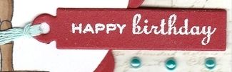
 
Details of the hat image were then highlighted using the clear Wink of Stella brush pen, and three teal pearls from Hobby House Sea Charm pearls.


Friday, 30 October 2015

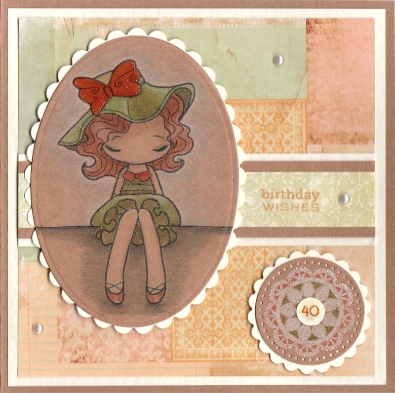
Green and Orange Dressy Miss Anya Pencils On Kraft Card

This is an up-to-date card from me today.

This is the card that I made for my sister for her 40th birthday earlier this month. It's always a worry when your 'little sister' hits 40 - a big reminder that you are the 'big sister'!!!
 
Anyway, back to the card!
 
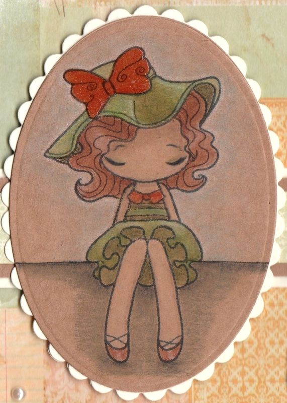
This card uses a technique I've never used before - colouring with pencils onto kraft card. Unfortunately I can't afford the lovely Prismacolor pencils, so I have used the WHSmiths set of 36 colouring pencils here. The results probably aren't as striking as they might have been had I used those pencils, but I think it works all the same.
 
 
I started by stamping the Miss Anya Dressy image from The Greetings Farm with Memento Tuxedo Black dye ink onto the kraft card and used a selection of the pencils to colour her in. To blend  the pencils, I used plain old baby oil.
 
Once the colouring was finished, I added some clear Wink Of Stella to the orange sections of the image, so her collar, shoes and bow.
 
The image was then diecut using a Petite Oval Nestabilities die and matted onto a cream scalloped Petite Oval die.
 
 
 A piece of collaged patterned paper from the Prima Songbird paper pad was matted onto the front of the card and a strip of blue paper from the same paper pad was matted across it.
 
The sentiment, from the Personal Impressions Paula Pascual Mixed Sentiments stamp set was stamped directly onto the patterned paper using Memento Cantaloupe dye ink.
 
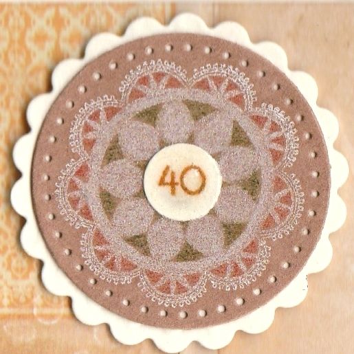
The next step was to remind my sister as subtly as possible that she was hitting a landmark birthday. To do this, I needed some small number stamps, but I don't have any. So I resorted to printing some out from the computer and diecutting them using one of my cog dies from the XCut Chronology Cogs set.
 
 
The die highlighted above has just the right sized circles that I required.
 
Firstly, the doily image from the Martha Stewart Doily stamp set was stamped onto kraft card using Memento Luxe Wedding Dress pigment ink. This was then coloured using a couple of the WHSmiths pencils that were used in the main image.
 
 
The inside of the card was also decorated, using matching papers and an oval diecut panel. The sentiment, also from the Mixed Sentiments stamp set, was stamped using the Cantaloupe ink and die cut using a circle Nestabilities die.

Sunday, 25 October 2015

Brown, Cream and Blue Patchwork Background Bumble Bee Gorjuss Girl

Well, as promised, here is an older card that I made that is waiting to be blogged. This is a card that I made for my mum's birthday using the Bumble Bee Gorjuss Girl by Sugar Nellie.

I also decided to use my Sizzix Hexagon Framelits dies and create a patchwork background.


So, the image was stamped using Memento Tuxedo Black dye ink and coloured using Copic markers:

Hair: E31, E33,E35
Skin: E000, E00, E04, E21, R20
Sash/Hearts/Socks: YR04, W1
Wings/Dress: G00, G21,W1

The image was then fussy cut.


A Classic Oval Nestie was used to die cut white card and was embossed using the Sizzix Basic Grey Snow Cap embossing folder. This was then matted onto a scalloped oval of sky blue cardstock from the DCWV Brights Matstack.

A number of hexagons were die cut from ivory hammer cardstock as well as papers from the Prima Songbird paper pad. These were matted and layered together and pieced together on a square of the sky blue cardstock to create the background.


A length of the Dovecraft blue and brown striped ribbon was knotted and then adhered across the patchwork panel before the panel was adhered to the cardblank.
The Gorjuss Girl image was then matted onto the ovals and then they were added to the centre of the patchwork background.

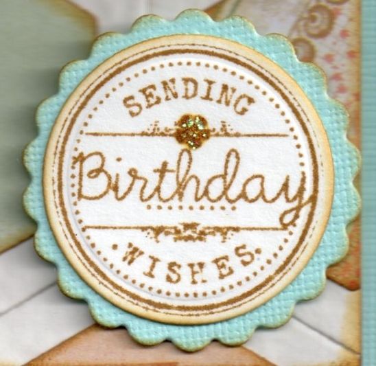
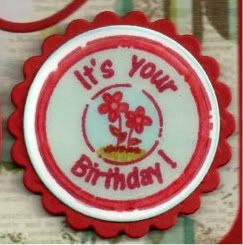
The sentiment, from the Wild Rose Studio Birthday Circles stamp set, was stamped using Tim Holtz Frayed Burlap distress ink and die cut with a Nestie circle die and matted onto a scalloped circle Nestie diecut.

As a finishing touch, Ranger Crystal Stickles glitter glue were added to the wings on the image and details on the sentiment.

Saturday, 24 October 2015

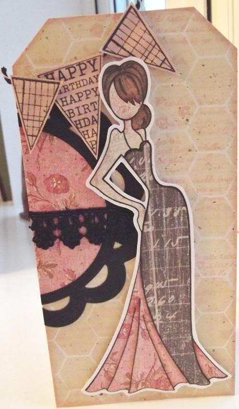
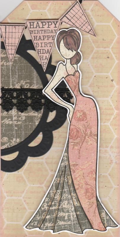
Pink Black and Beige Paper-Pieced Prima Doll

I should begin by apologising for the picture quality of this card. Normally I scan my cards in but my scanner had decided to give up the ghost (well, actually the printer had, and so the scanner just played along). Anyway, these were photographed and I couldn't find my mini tripod so getting up close and holding the camera perfectly steady wasn't easy!!

This card shows my first attempt at using my Prima Doll stamp Tasha. I actually made it at the cardmaking group that I go to and it was great fun.
Paper-piecing the image is actually very simple to do. The hard part is choosing which papers to use.
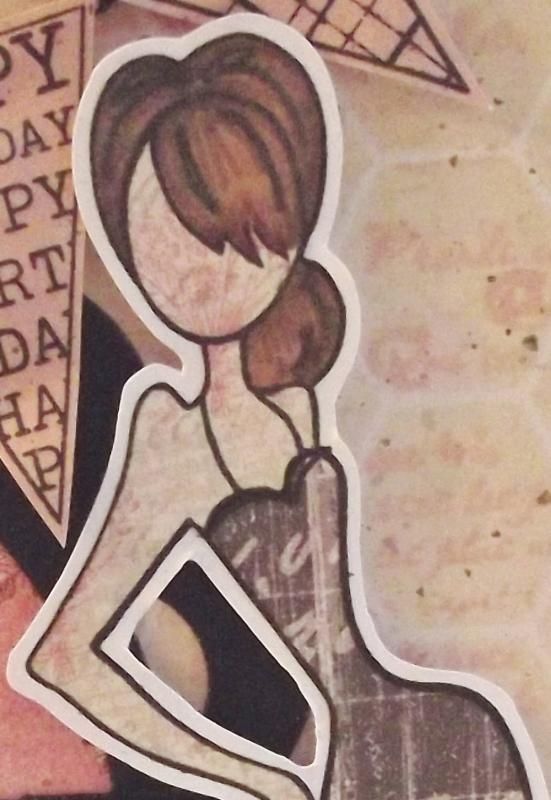
I began by stamping the whole image onto some white card using Memento Tuxedo Black dye ink. The image was then stamped again onto three different patterned papers from the K&Co Best of Too paper pad, using papers from the Life's Journey and K-Ology Hannah collections. I do love this paper pad, and it is much underused. I really should get it out more. The next stage was to cut the various pieces from the different papers and assemble them onto the base image. The hair was coloured onto the patterned paper using Promarkers.
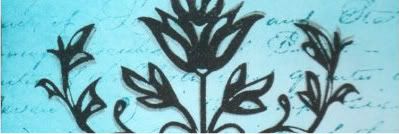
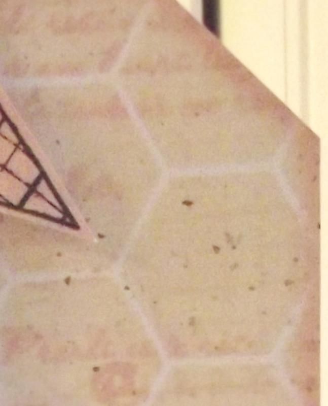
The next stage was to create a background for the image to sit on. I started with a piece of 'natural' paper which has tiny flecks in it. I then taped the Memory Box Chicken Wire stencil over the piece and sponged through Tim Holtz Antique Linen distress ink. Once that was done, with the stencil still in place, the French Text stamp from the Bo Bunny It Is Written stamp set was stamped through the stencil using the Tattered Rose ink. This was matted to the front of a DL card blank that was cut into the shape of a tag.

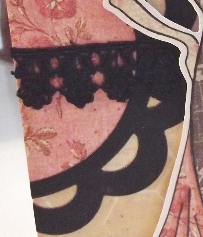
In order to create a bit more interest behind  the doll image, the Marianne scalloped circle frame was diecut from black card and a circle of the pink patterned paper used on the dress was diecut to fit within it. A length of black lace was wrapped around the circle and matted together on the edge of the tag and the excess cut away.


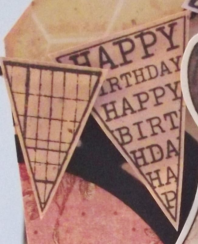
I then wanted to add a sentiment to the card and decided to use the banner stamps from the Hero Arts Friendly Flags stamp set. These were stamped onto the inked natural paper, inked with the Antique Linen and Tattered Rose inks. These were cut out and adhered to black and white Gorjuss Baker's Twine in the top left corner.


I also made a second card using the other parts of the stamped image.

Wednesday, 21 September 2011

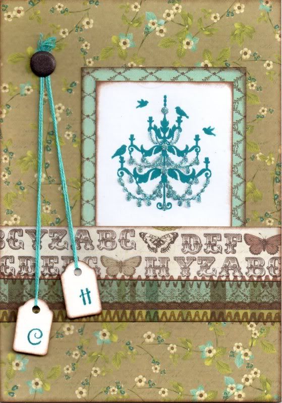
Brown and Blue Floral Chandelier Tags Anniversary

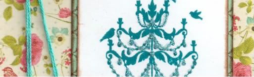
This is a second version of the anniversary card I made recently using the Chandelier stamp that came free with the July 2011 issue of Craft Stamper Magazine.


I went for more muted tones with this version, using one of my favourite colour combinations of blue and brown.

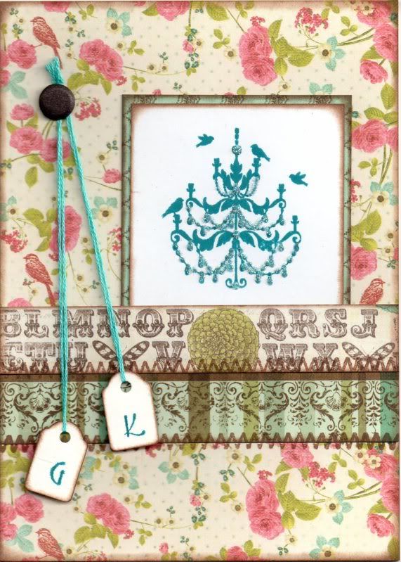
The Chandelier image was stamped using Adirondack Stream dye ink and matted onto the blue diamonds paper from the Prima Madeline paper pad.


The card blank was completely covered with the Brown Script Floral paper from the same paper pad and the image panel added to the right.

A strip of the Alphabet paper was added to a strip of the Multi Border paper and this was then added over the image panel. Faux stitching was then added over the joins of the paper pieces using the Zigzag Stitch stamp from the HOTP Stitches stamp set and ColorBox Chestnut Roan Fluid Chalk ink.

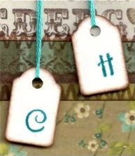
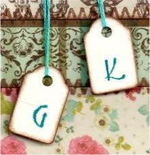
Two mini tags were coloured around the edges using the Chestnut Roan ink and letters were stamped using the Stream ink and a Studio G mini alphabet stamp set. The tags were attached to some teal embroidery thread and added to the card and a brown Card Candi from Craftwork Cards was added over the ends of the threads.


Highlights were added to the Chandelier image using Glossy Accents and DecoArt Crystal Glamour dust.
All papers were distressed with the Chestnut Roan ink.

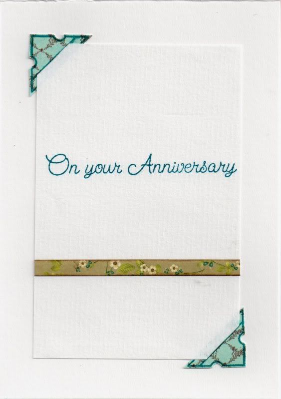
The inside of the card was also decorated using a photo corner stamp from the Stamps Away Bookplates, Corners and Anchors stamp set, stamped onto the blue diamonds paper used on the front of the card using the Stream ink and cut out


Slits were cut into the photo corners and the writing paper inserted into the corners, and a strip of the Brown Script Floral paper used on the front of the card was added across the paper and the sentiment, from Elzybells, was stamped using the Stream ink.

Here are the blog challenges I am entering this card into:

Wednesday, 14 September 2011

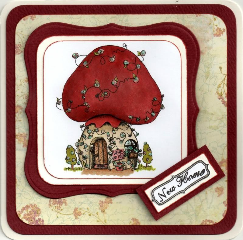
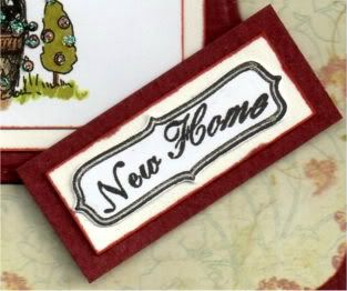
Red and Cream Tiddly Inks Mushroom New Home

I needed to make a New Home card for my friend who has just moved back to Germany. Of course, having made the card, I learnt that there were issues with the new house and so they weren't actually moving into it. But, thankfully all the issues have now been resolved and they can now move out of the hotel and into their new home.


I decided that I would make the New Home card using this cute digi image.

The Mushroom House digi image, from Tiddly Inks, was coloured with Copic Sketch markers:
  • Mushroom Roof: E04, E07, E09, R02, R37, R39
  • Mushroom Base: Y00, Y02, Y11, E40, E41, E43
  • Door: E33, E35, E37
  • Window Frame: E35
  • Window: BG10
  • Grass/Leaves/Trees: YG13, YG95
  • Flowers/Sign/Door Mat: R02
  • Pot: E07
  • Shadow: E35, E43
  • Letters: E40

The corners of the image panel were then punched with the large XCut corner rounder. This was then matted onto a panel of cream card and a panel of deep red card die cut using a Nestabilities Labels 1 die.

A panel of the Cream Floral Script paper from the Prima Botanical paper pad was matted onto the red card, both punched with the corner punch.

The sentiment panel was created by stamping the curly frame image from the Papermania Tweet stamp set using Versafine Onyx Black archival pigment ink and the sentiment from the Papermania Mix and Match Scrolls and Sentiments stamp was stamped in the centre using the same ink. The frame was cut out and matted onto the cream and red cardstocks.


The flowers on the main image were then highlighted with Craft Planet Iridescent Sparkle glitter glue.

The frame of the sentiment panel was traced around using the clear Sakura Stardust pen.


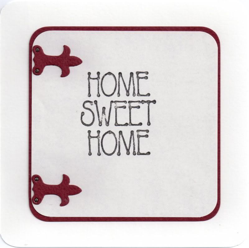
The inside of the card was also decorated, using my much-neglected Sizzix Sizzlits Latches die. The rivets of the latches were coloured using the 110 Copic sketch marker and traced over with the clear Sakura Stardust pen.

Here are the blog challenges I am entering this card into:

Wednesday, 24 August 2011

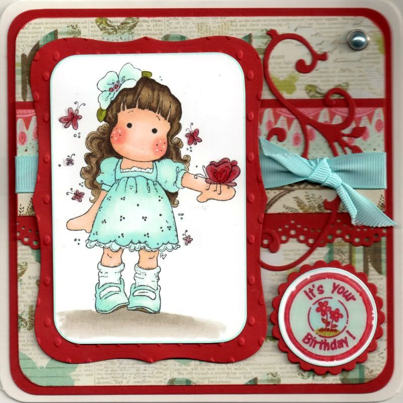
Red and Aqua Tilda With Hawaiian Flower

The Tilda with Hawaiian Flower image from Magnolia was very kindly donated to me by the lovely, talented Teresa/Craftingallday.

The image was stamped with Memento Tuxedo Black dye ink and coloured with Copic sketch markers:
  • Hair: E43, E44, E49
  • Skin: E00, E21, E51, R02, R20
  • Dress; B00, BG10, BG11
  • Flower: B00, BG10, BG11, R32, R37
  • Leaves; YG13, YG95, E44
  • Butterflies: R32, R37, R39
  • Socks: BG10
  • Lace Frills: BG10
  • Shoes: B00, BG10, BG11, E44
Tilda's cheeks were then highlighted with the Papermania Snow White gel pen.

Once again, large parts of this image were coloured using the Transfer Technique as discovered in the Copic Colouring Guide, using both the lighter shades and the blender pen.

The image panel was then trimmed and the corners rounded with the large XCut corner rounder punch. This was then matted onto a panel of red card die cut using a Labels 8 Nestabilities die and embossed with the Indentz Ellipse embossing folder.

A strip of the blue floral border paper from the Prima Madeline paper pad was matted onto a strip of the red card that was punched with the Martha Stewart Doilly Lace punch. A length of aqua grosgrain ribbon was wrapped around the strip and a shorter piece was knotted to the right.

This strip was then attached across a panel of the butterflies paper from the same paper pad and a Marianne Creatables leaf flourish die cut, also cut from the red card, was tucked under the ribbon.

The image panel was then added over the ribbon.

A large pale blue pearl brad from Papermania was added in the top right corner.

The circle sentiment, from Aud Designs, was stamped using Memento Rhubarb Stalk dye ink and coloured with Copic markers:
  • R32, R37, BG10, BG11, B00, YG13, YG95

This was then die cut using a classic circle Nestabilities die and matted onto a red classic scalloped circle.
Once the card was fully assembled, the circle sentiment and the butterflies in the image were then highlighted using Ranger Glossy Accents.

I also decorated the inside of the card using a strip of the border paper matted onto a strip punched with the Doilly Lace punch. The sentiment stamp, from the Papermania Clare Curd Sentiments stamp set, was stamped using the Rhubarb Stalk ink.

Here are the blog challenges I am entering this card into:

Wednesday, 17 August 2011

Light Blue and Cream Pollycraft Cherry Kisses Tea in the 20s

Here is the birthday card that I made for my aunt. She is only four years older than me so thought this image was appropriate. I think it's a really cute image and is one I won in a blog challenge.


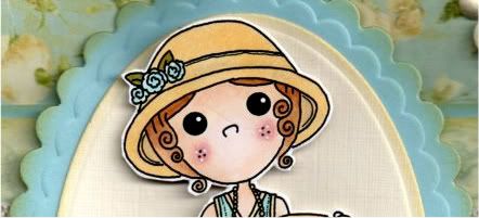
The digi image, Cherry Kisses Tea in the 20s, from Pollycraft, was printed out and coloured with Copic Sketch markers:
  • Hat: E41, Y21, BG11
  • Flowers: BG11, B00
  • Leaves: YG95, G07
  • Hair: E33, E35, E37
  • Skin: E00, E21, E51, R02, R20
  • Dress: Y21, BG10, BG11, B00
  • Shoes: BG10, BG11, B00
  • Cup: Y21, E41, BG11, B00
For quite a lot of this image I used what is called the Transfer Blending technique whereby a darker colour chisel nib is held to the brush nib of a lighter colour, thereby transferring the ink. Whilst colouring, the two colours blend together. This was done on the flowers, leaves, shoes and the dress in particular. I discovered this technique in the Copic Coloring Guide book that I recently purchased from WHSmith Online.

The image was then cut out.


A scalloped petite oval was die cut, using a Nestabilities die, from light blue cardstock and distressed around the edges using Tim Holtz Antique Linen distress ink and a plain petite oval, also distressed, was matted on top. The image was then centrally matted using 3D foam pads.

A strip of the light blue and cream scroll paper from the Prima Botanical paper pad was matted onto a strip of the light blue card that has been punched with the XCut Lace Trim border punch and a length of cream crochet lace was wrapped around it.

This was then matted onto a panel of the light blue and cream roses paper from the same paper pad and matted onto the light blue cardstock. All panels were distressed with the Antique Linen ink.

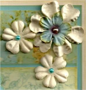
Three cream Prima paper flowers from the Botanical Mix were added in the top right corner. A light blue Prima flower was added in the centre of the large flower and turquoise self-adhesive pearls from the Hobby House Sea Green set were added in the centres of the smaller flowers and a champagne pearl from the Kort & Godt Autumn set of pearls was added in the centre of the larger flower.


The sentiment, from the Papermania Clare Curd Sentiments stamp set, was stamped onto the cream card using Memento Rich Cocoa dye ink and matted onto the light blue cardstock and added in the bottom right corner of the card.


Here are the blog challenges I am entering this card into:

Wednesday, 10 August 2011

Pink and Blue Floral Chandelier Tags Anniversary

Here is an anniversary card that I made for a couple of friends. I really like the design (I actually adapted it from one of the projects in the July 2011 issue of Craft Stamper magazine using this particular stamp).


I absolutely love the Chandelier image tht came with the July 2011 issue of Craft Stamper magazine. The image was stamped using Adirondack Stream dye ink and matted onto the blue diamonds paper from the Prima Madeline paper pad.


The card blank was completely covered with the Floral Bird paper from the same paper pad and the image panel added to the right.

A strip of the Alphabet paper was added to a strip of the Multi Border paper (both from the Madeline paper pad), and this was then added over the image panel.

Faux stitching was then added over the joins of the paper pieces using the Zigzag Stitch stamp from the HOTP Stitches stamp set and ColorBox Chestnut Roan Fluid Chalk ink.

Two mini tags, that have been in my stash since the beginning of time, were coloured around the edges using the Chestnut Roan ink and letters were stamped using the Stream ink and a Studio G mini alphabet stamp set (also underused!!). The tags were attached to some teal embroidery thread and added to the card and a brown Card Candi from Craftwork Cards was added over the ends of the threads.


Highlights were added to the Chandelier image using Glossy Accents and DecoArt Crystal Glamour dust.

All papers were distressed with the Chestnut Roan ink.

The inside of the card was also decorated using a photo corner stamp from the Stamps Away Bookplates, Corners and Anchors stamp set, stamped onto the blue diamonds paper used on the front of the card using the Stream ink and cut out.


Slits were cut into the photo corners and  the writing paper inserted into the corners, and a strip of the Floral Bird paper used on the front of the card was added across the paper and the sentiment, from Elzybells, was stamped using the Stream ink.

Here are the blog challenges I am entering this card into:

Sunday, 24 July 2011

Black and Teal Fleur de Lis Script Anniversary

This card was inspired by a card I saw made by the lovely LizzieS. I told her I'd be borrowing the idea!!!


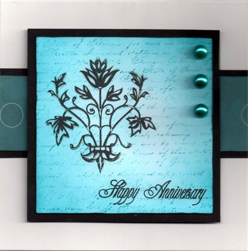
I started by colouring a panel of white card with Adirondack Stream dye ink using a shaving brush and overstamped using the same ink with the Prima Notary stamp, using second-generation ink.

The Fleur de Lis mini stamp from Inkadinkado was stamped over the top using Versafine Onyx Black archival pigment ink, as was the Stamps Away Happy Anniversary stamp.


The image panel was then matted onto black card.

A strip of teal floral circle paper, from the Papermania Temptations Big One paper pad, was matted onto the black card and across the card blank and the image panel matted over the top.

Three large teal pearls (from the Create and Craft carousel) were added in the top right corner.


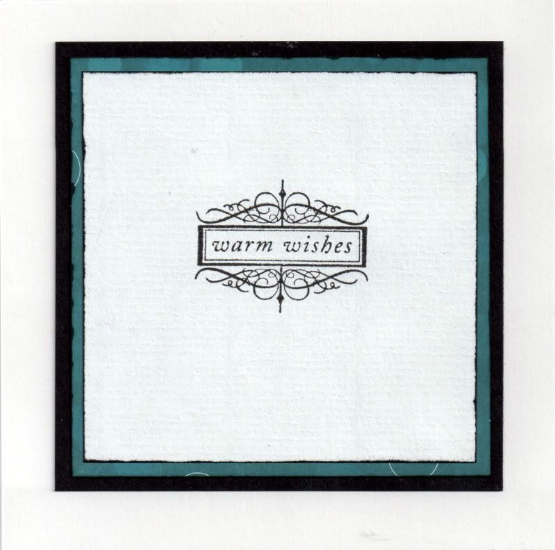
I also decorated the inside of the card using the Warm Wishes stamp from the Hot Off The Press Sentiments stamp set and the Onyx Black ink.

Here are the challenges I am entering this card into:

Thursday, 5 May 2011

Pink and Kraft Flower Horace

Well, I finally managed to struggle my way into my craft room - avoiding the obstacle course on the floor (just about) and managed to get a few cards made. Top of my immediate-need list was a card for a young girl, so I decided to use the lovely cute Horace stamp that I got free from the April 2010 Craft Stamper magazine.


The Horace image, from Pink Gem/Craft Stamper, was stamped using Memento Tuxedo Black ink and coloured with Copic sketch markers:
  • Dog: E31, E33, E35
The image was then die cut using a classic circle Nestabilities die and the edge coloured using RV19 Copic sketch marker and matted onto a big scalloped circle die cut from the pink stripe paper from the Daisy and Dandelion Picnic Patch paper pad. The edges were coloured using ColorBox Orchid Pastel Fluid Chalk ink and then matted onto a dark pink panel die cut using a Labels 3 Nestabilities die.


A strip of the pink daisy paper, from the same paper pad, was punched using the XCut Scallop border punch and the edges coloured using the Orchid Pastel ink and matted onto a punched panel of the dark pink card.

A white Prima paper flower was coloured using a Copic marker (E31) and added to the Labels shape. Pink flower gems from Papermania were added to the image and the centre of the paper flower.

The sentiment, from the Papermania Clare Curd Sentiments stamp set, was stamped at the bottom of the card blank using Adirondack Raspberry dye ink.

Here are the challenges that I am entering this card into:

Thursday, 28 April 2011

Red, Black and Gold Oriental Birdcage

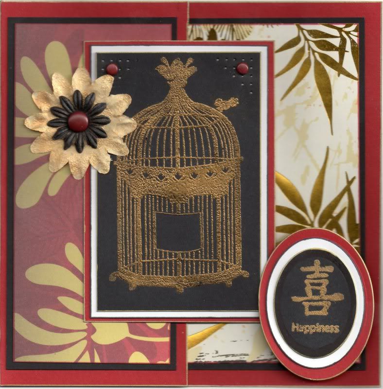
Here's the card I made for my mother-in-law for her birthday. I wanted to use my oriental papers and after using the mica powder on hubby's birthday card, I wanted to try the Stamp 'n' Bond powder with it to see how it works.


The Birdcage image, from the Papermania Tweet stamp set and the Little Bird image from the Papermania Chatsworth Furnishings stamp set were stamped using Versacolor Black pigment ink onto black card and Stampendous Stamp 'n' Bond embossing powder was added and heated. The Gold Lustre Iridescent Mica Pigment Powder from Stamps Away was then dusted over the sticky powder and left to set. (It tends to stay a bit sticky for a while but does set hard eventually).


Holes were pricked in the top corners of the image panel, using the Stampin' Up piercing template (Mat Pack) and small red brads from Papermania were added in the corners. This was then matted onto white and red card.

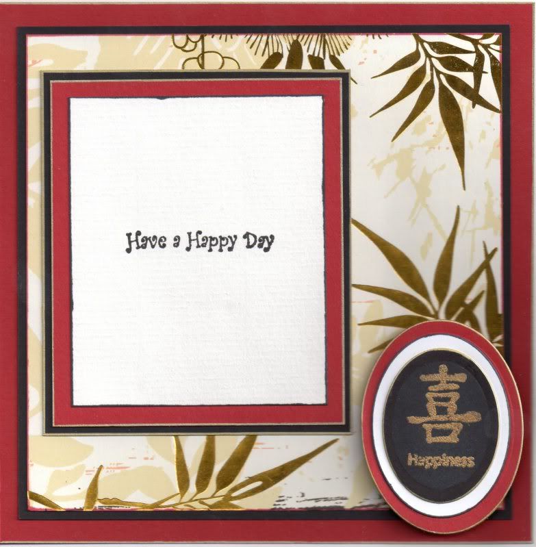
A half-front card blank was created from red card. The white and gold foiled bamboo paper from the Papermania Oriental Treasures paper pad was matted onto the black card and adhered to the inside of the card.


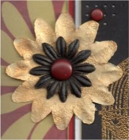
A white paper flower from Papermania Imaginisce was covered in Emboss Clear Pigment ink and then the Stamp 'n' Bond powder was added and heated to melt. The Gold Lustre mica powder was then dusted over the top. A smaller white paper flower from the Prima Botanicals Mix was coloured using a dark grey Copic marker (N9) and the Gold Lustre mica powder was lightly dusted over the top. The flowers were then layered up and a large red Papermania brad was added in the centre and attached to a panel of the red and gold chrysanthemum paper matted onto the black card. This was then adhered to the card front.


The sentiment panel was created by stamping the Happiness symbol and word from the Papermania Oriental Treasures Lanterns stamp set using the Versacolor Black ink onto a black oval die cut using a classic oval Nestabilities die. The Stamp 'n' Bond was added and heated and the gold mica powder dusted over. The sentiment panel was then matted onto larger red and white ovals, also die cut using the Nestabilities dies. The sentiment was added in the bottom right hand corner of the inside of the card, overlapping the image panel.


Here are the blog challenges I am entering this card into:
Blog Widget by LinkWithin